
DawnDash Usability Testing (continuation)
OVERVIEW
Dawndash is a mobile app designed to help users build consistent morning running habit in just 10 minutes a day. The app focuses on habit formation, motivation, and ease of use.
I focused on creating a clean, user-friendly design that keeps things effortless. The goal was to make running feel achievable and rewarding.
MY ROLE
UX-UI Designer, Storyboarding, Visual Design, Style Guide, Prototyping, Wireframing, User flow and site mapping
TIMEFRAME
8 Weeks
TOOLS
Figma, FigJam, Miro
THE CHALLENGE
A significant challenge was creating an app that felt motivating yet simple, encouraging users to stick with their running routine without overwhelming them. Providing a smooth experience for users of all levels is another challenge. I had to carefully balance simplicity and motivation to keep users engaged.
PROJECT GOAL
The goal of the DAWNDASH app is to help users build a consistent habit of morning exercise by guiding them through a quick, 10-minute run, with a focus on habit formation, motivation, and user engagement for daily physical activity.
Link to testing canvas
Usability Test insights & analysis
Usability Testing Summary
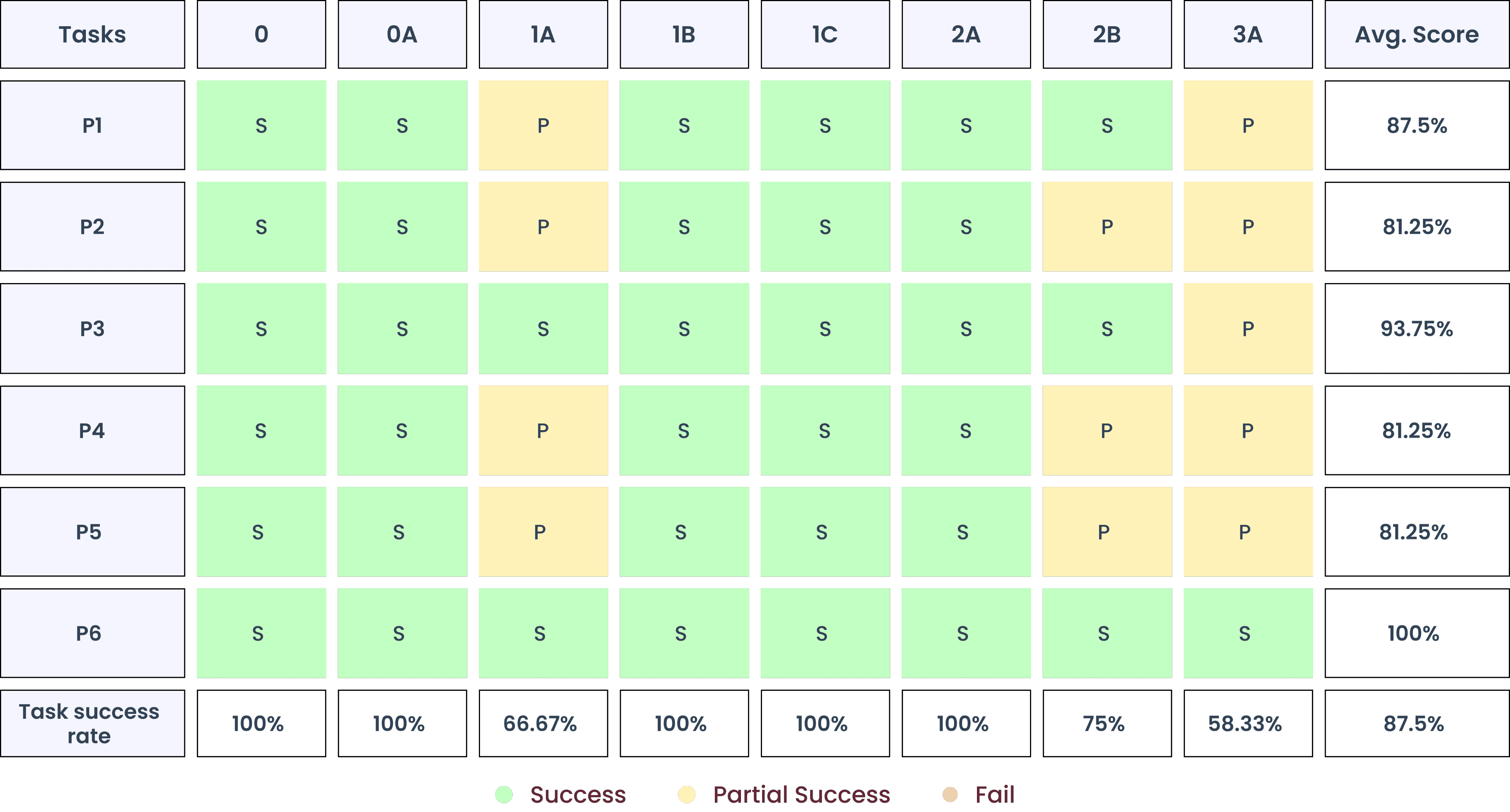
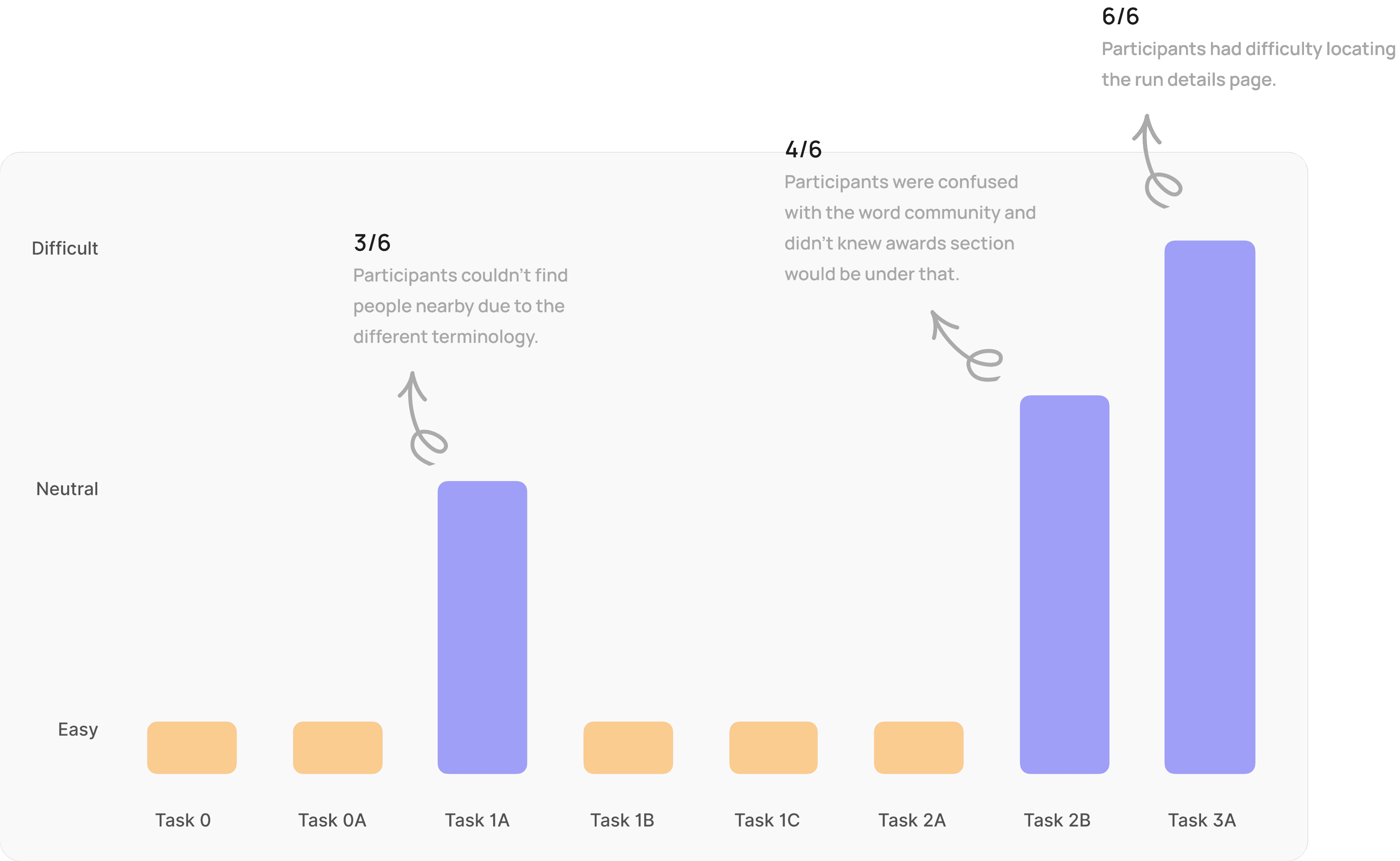
A total of 6 usability test were conducted, 3 in-person and 3 via zoom. Achieved 87.5% task success rate with no failed tasks. Participants appreciated the idea of running with nearby people, app felt clean & easy to use and discovering new routes feature was fun. What users found challenging was finding rewards section & some buttons or sections had unclear labels.
Participants
Total Number
6
Total Time
3.2 hrs
Total Issues
28
Confidence
& Ease
93%
Success Rate
87.5%
Delighters
56
Completed
tasks
48
Countries
1
Test Data
Findings
Average
Scores
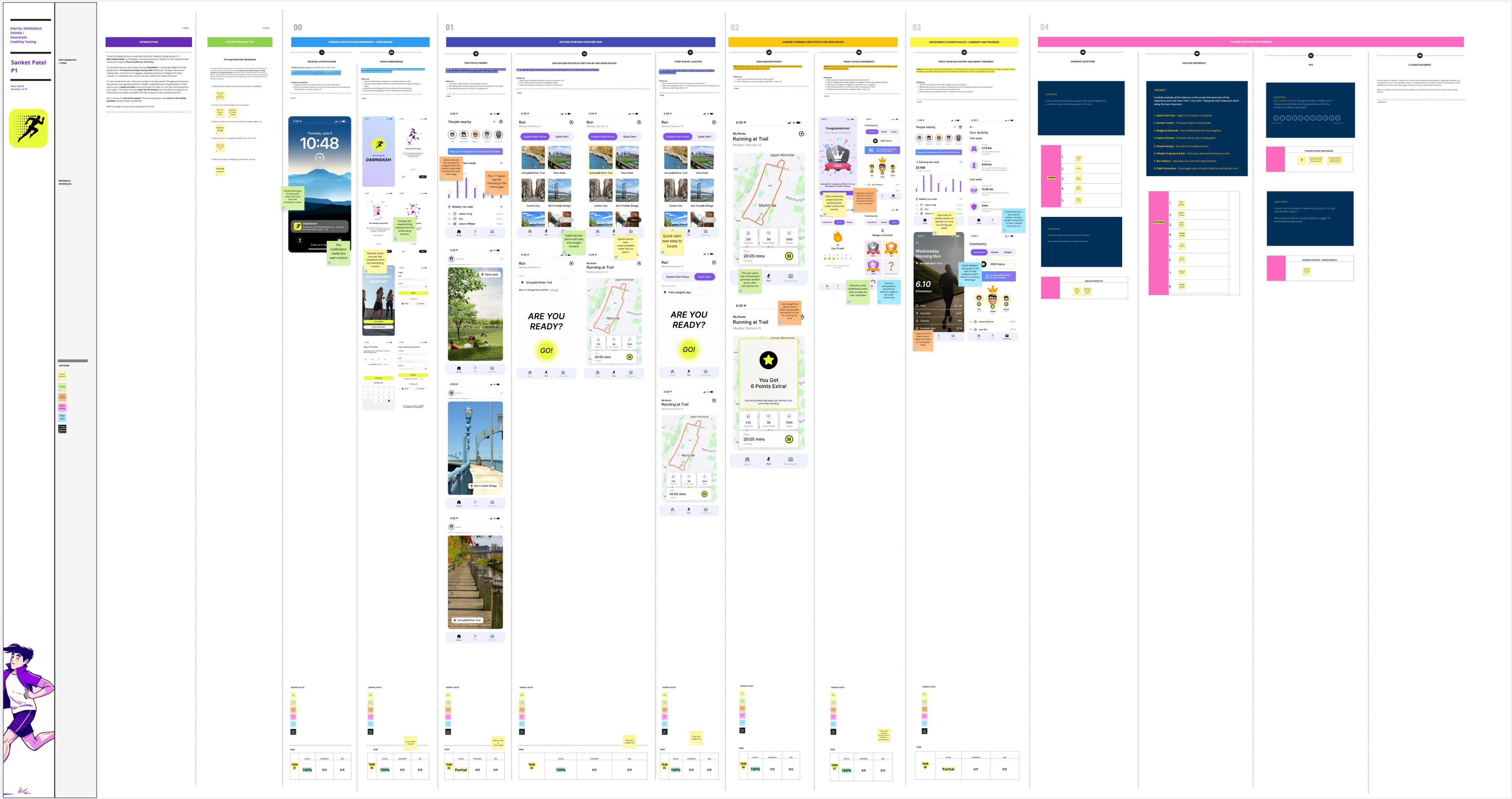
USABILITY TESTING TASKS

5
Icebreakers
8
Tasks
8
Post Survey
Questions


TASK SUCCESS RATE
87.5% of the tasks were successfully completed by the participants.
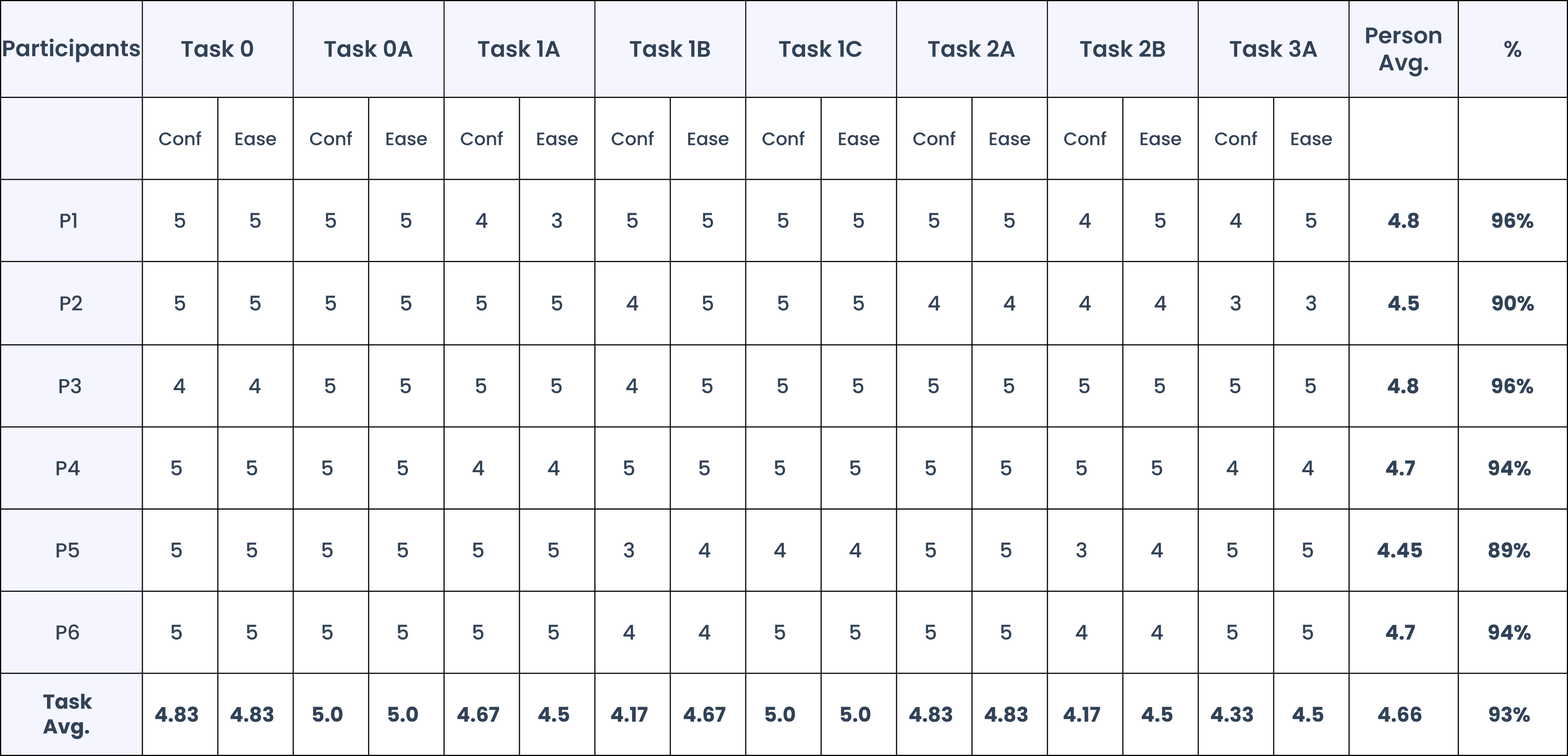
Ease & Confidence Score
ANALYSIS
Task difficulty bar graph
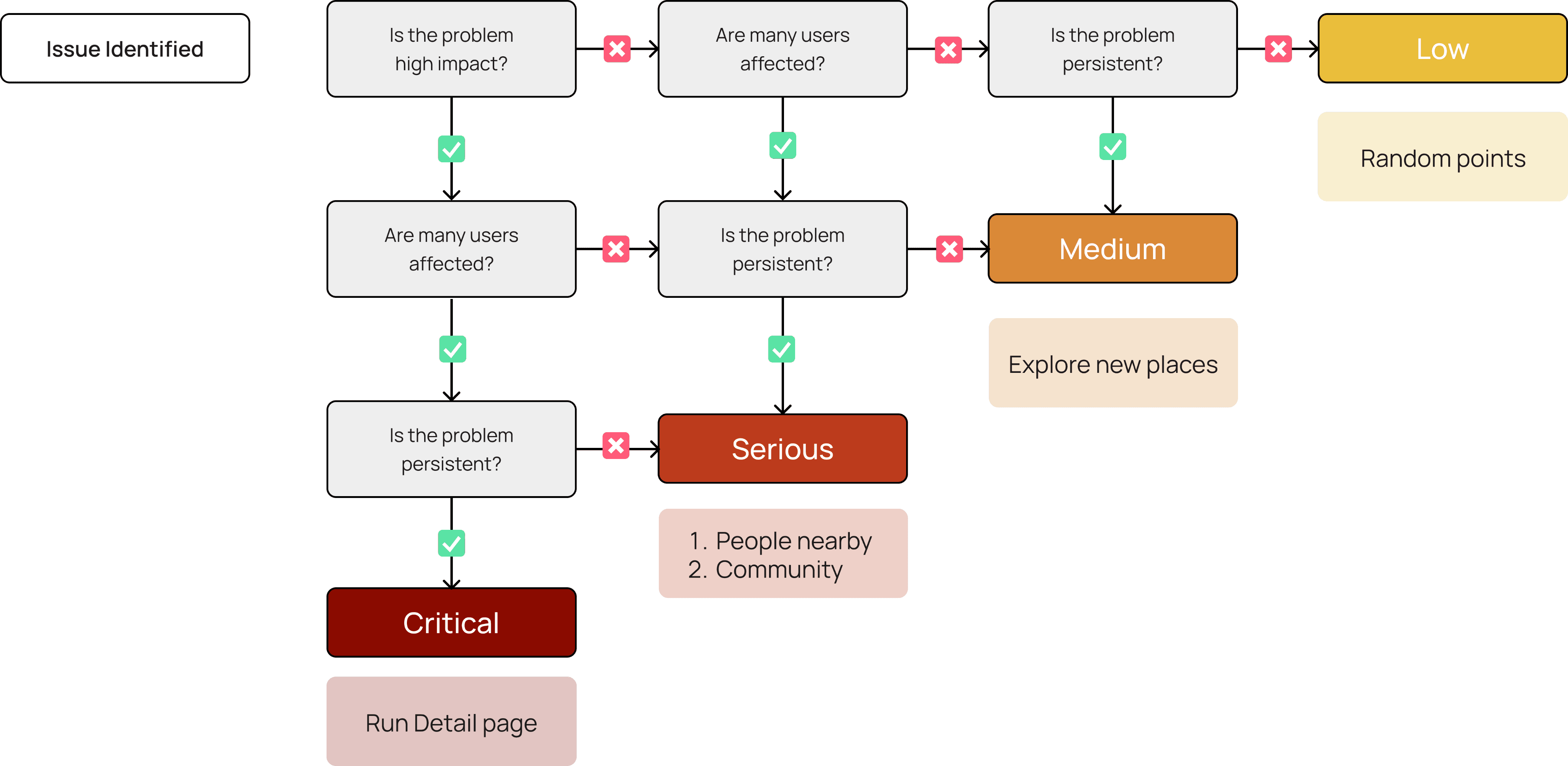
Decision tree for classifying the severity of a usability problem.
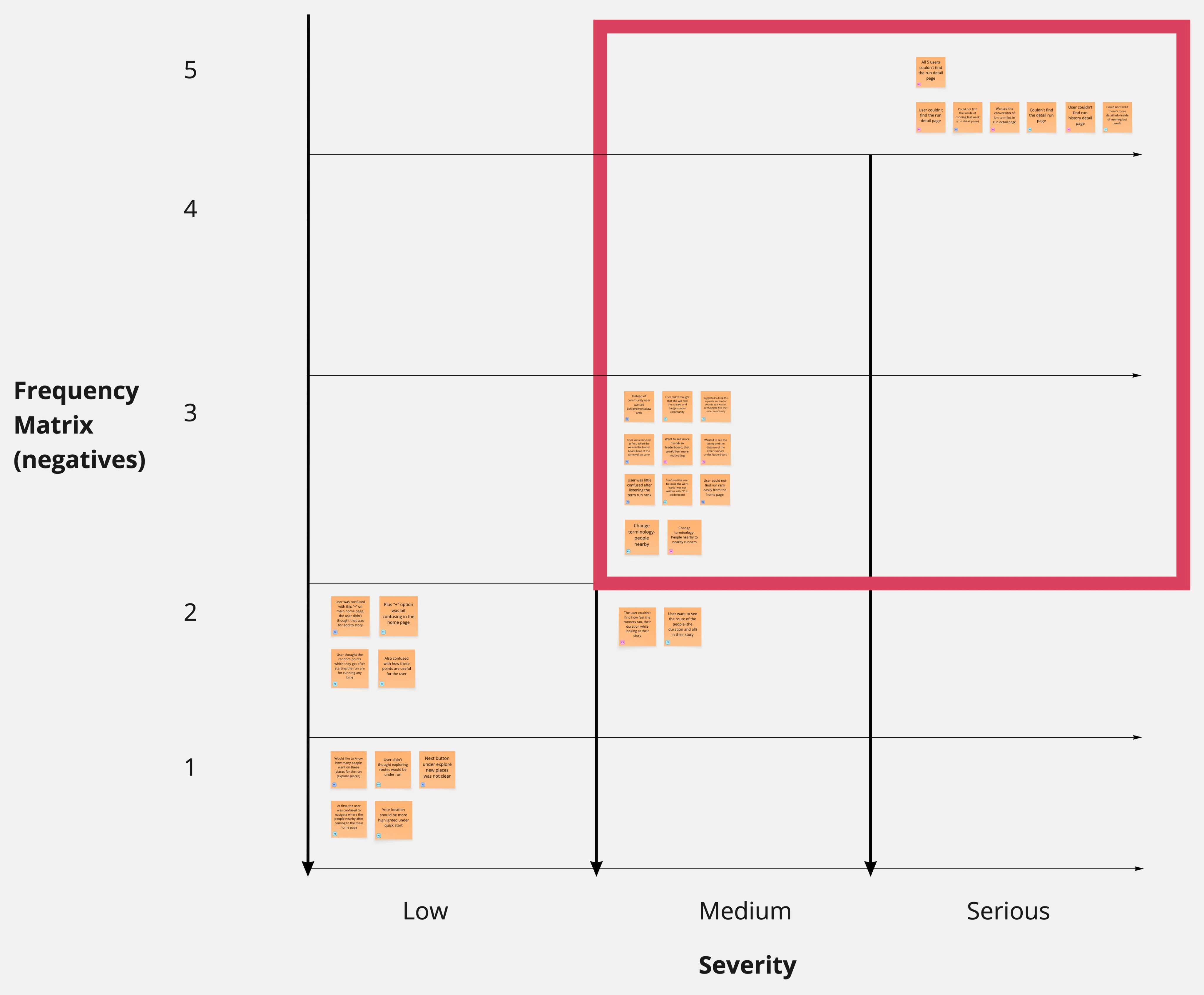
Frequency Matrix
Prioritizing Usability Findings for Optimal Impact
Post the Usability Testing I prioritized the critical and general feedback received in the area of improvement. In this Diagram the y-axis showcases how many participants faced the issue and the x-axis showcases severity of the issue
Usability Testing
TASK ANALYSIS
SCAMPER
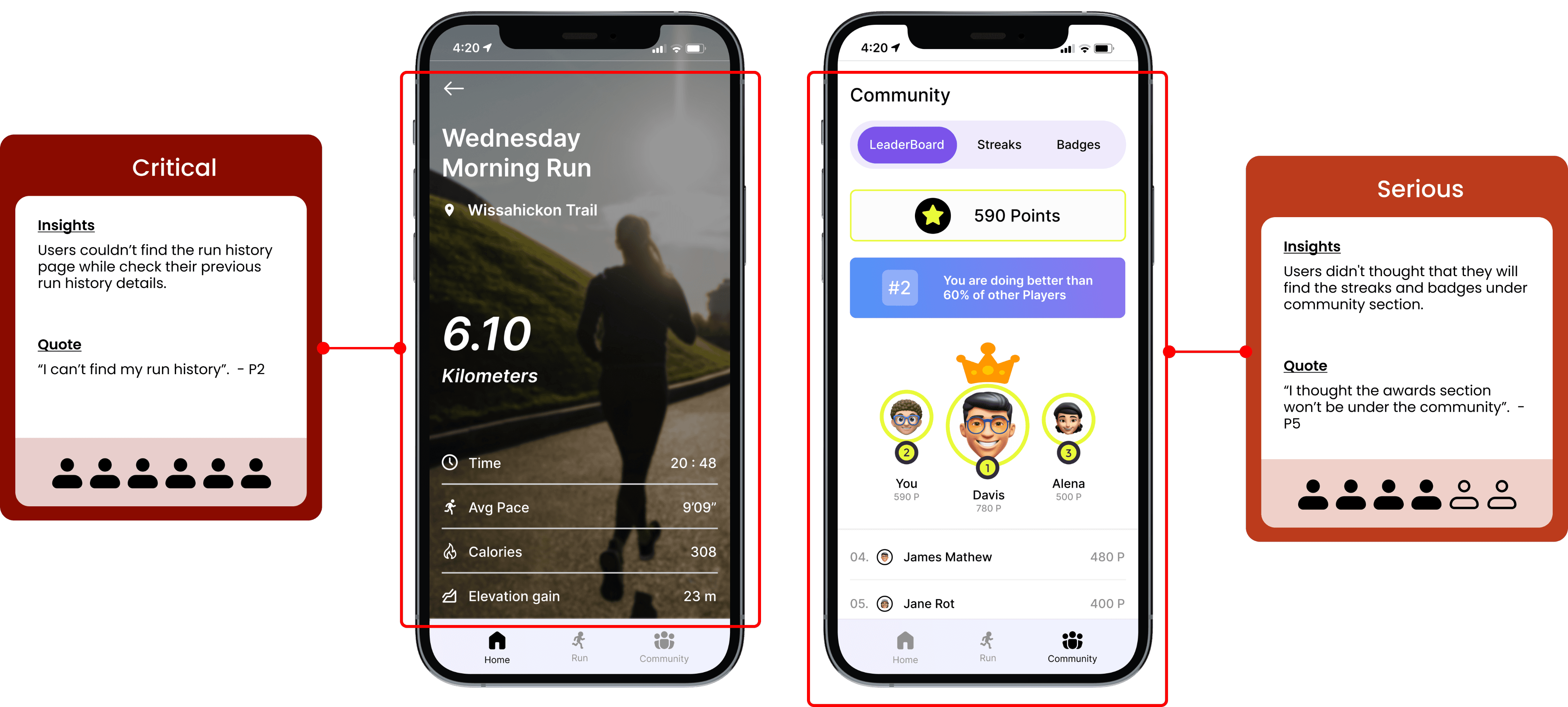
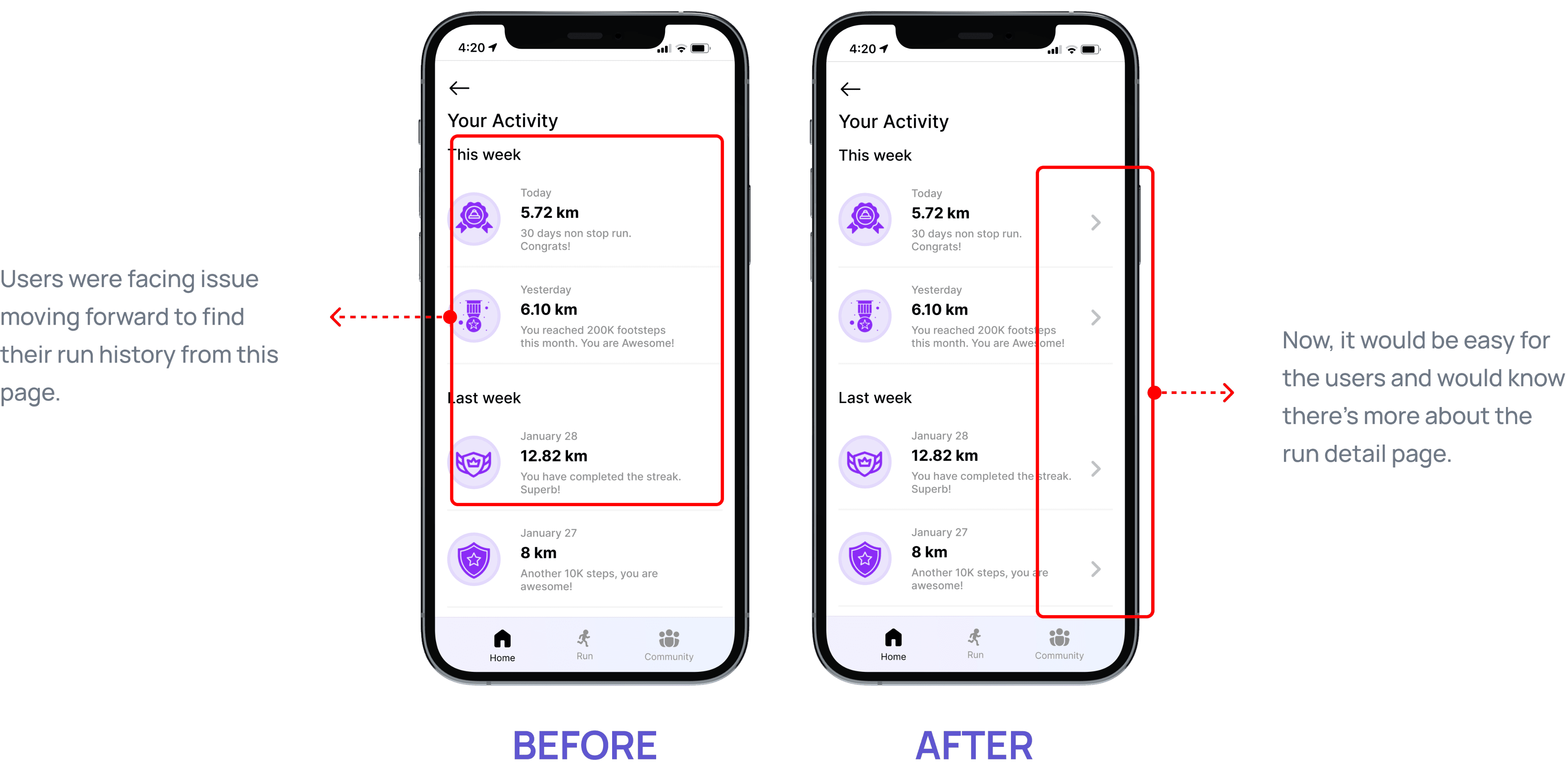
Run Detail Page: SCAMPER - Modify
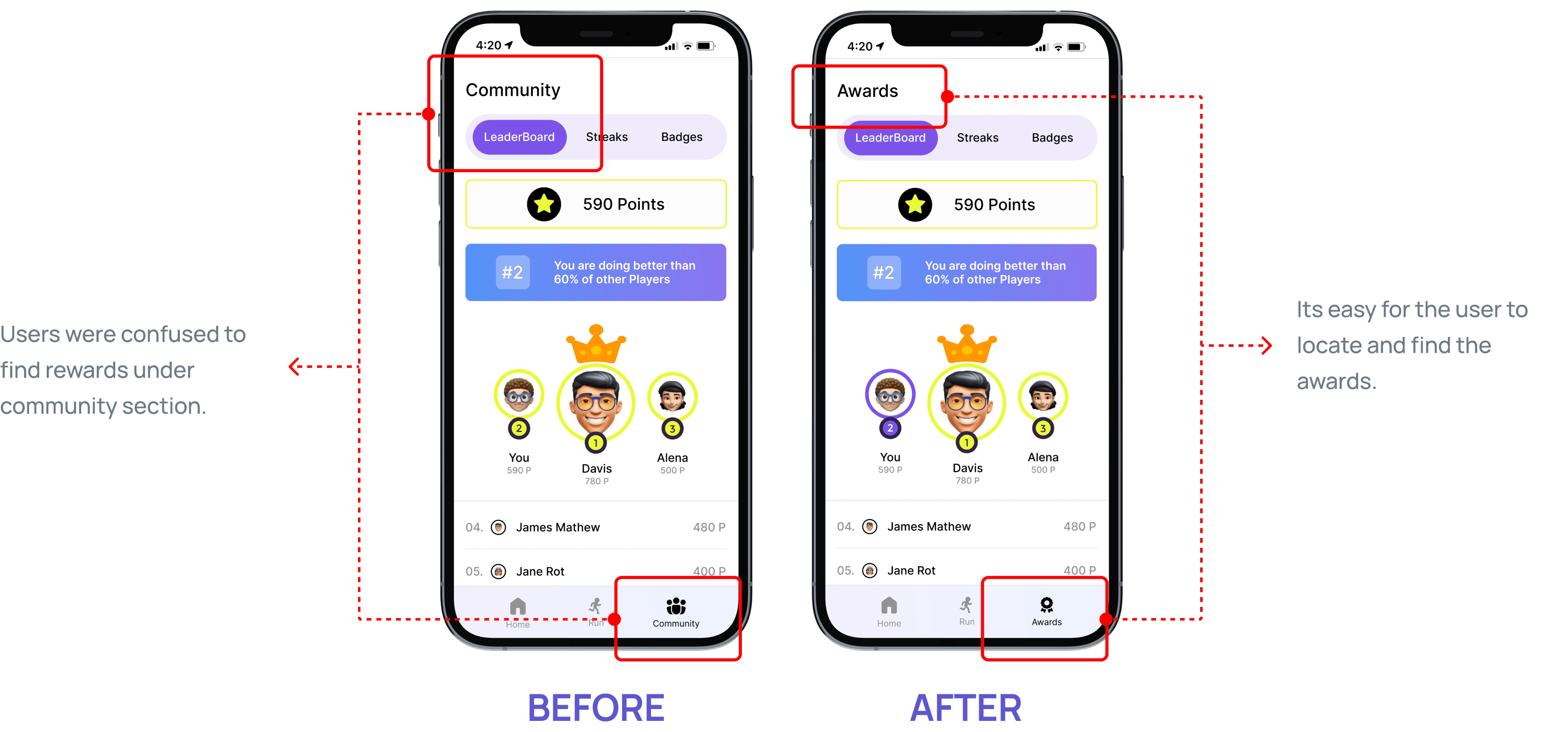
Community Section: SCAMPER - Eliminate
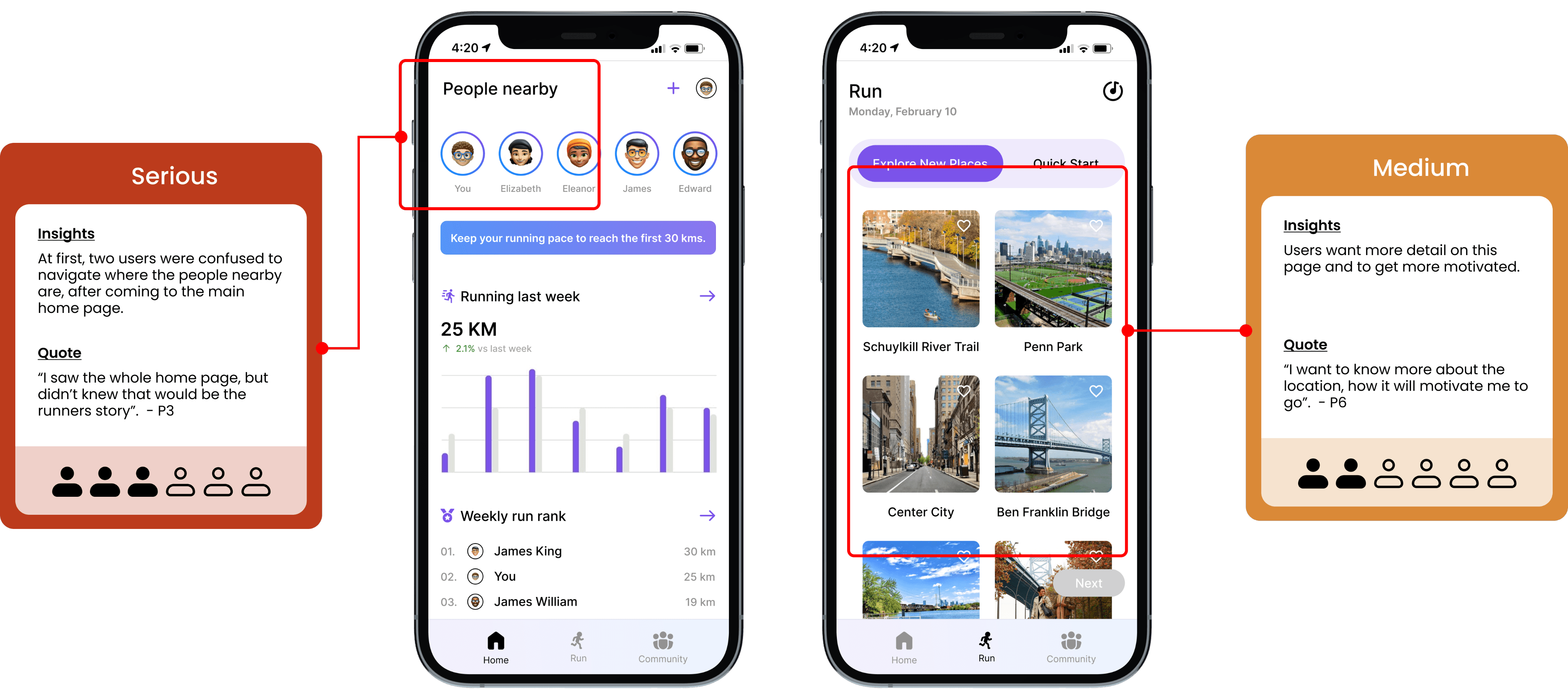
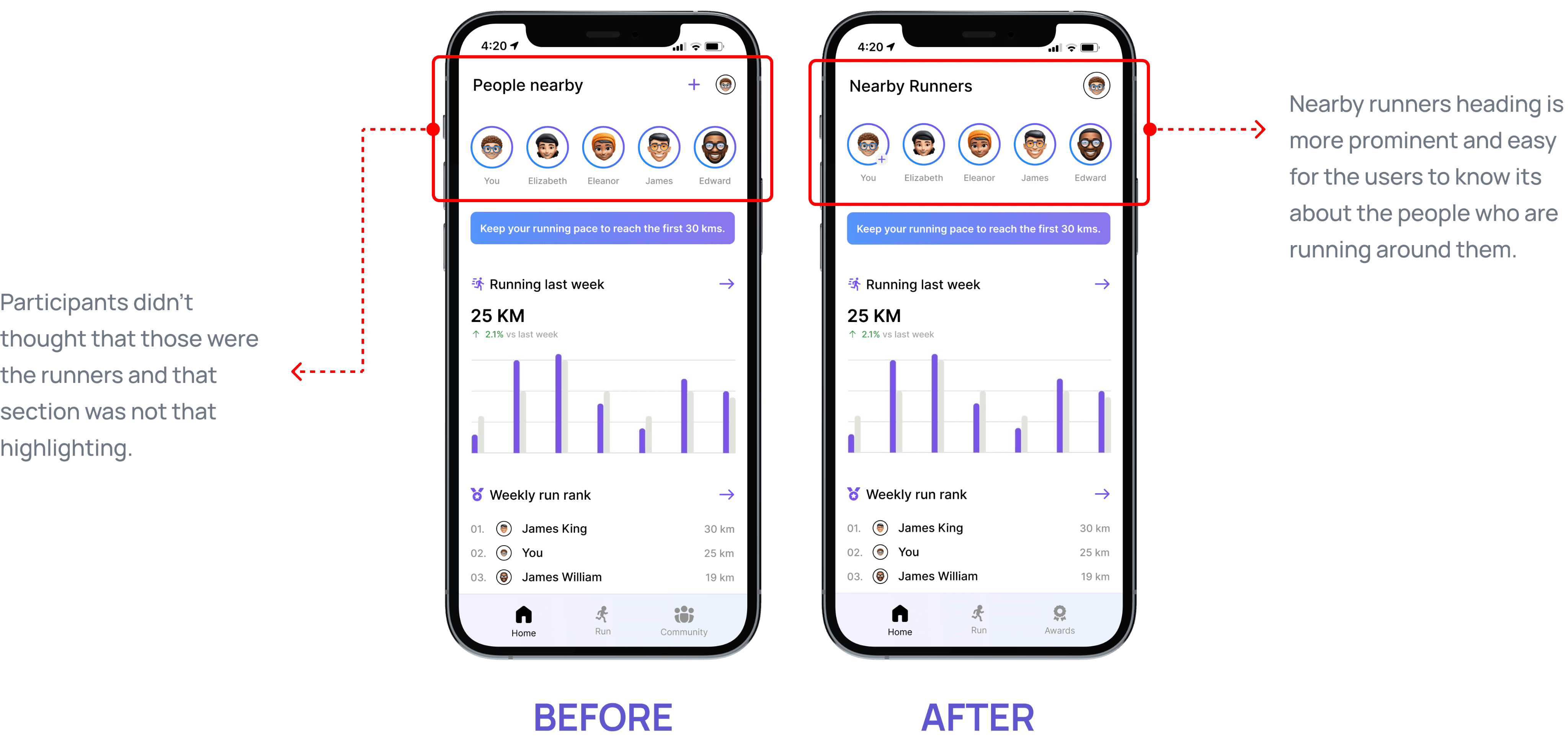
People Nearby: SCAMPER - Modify
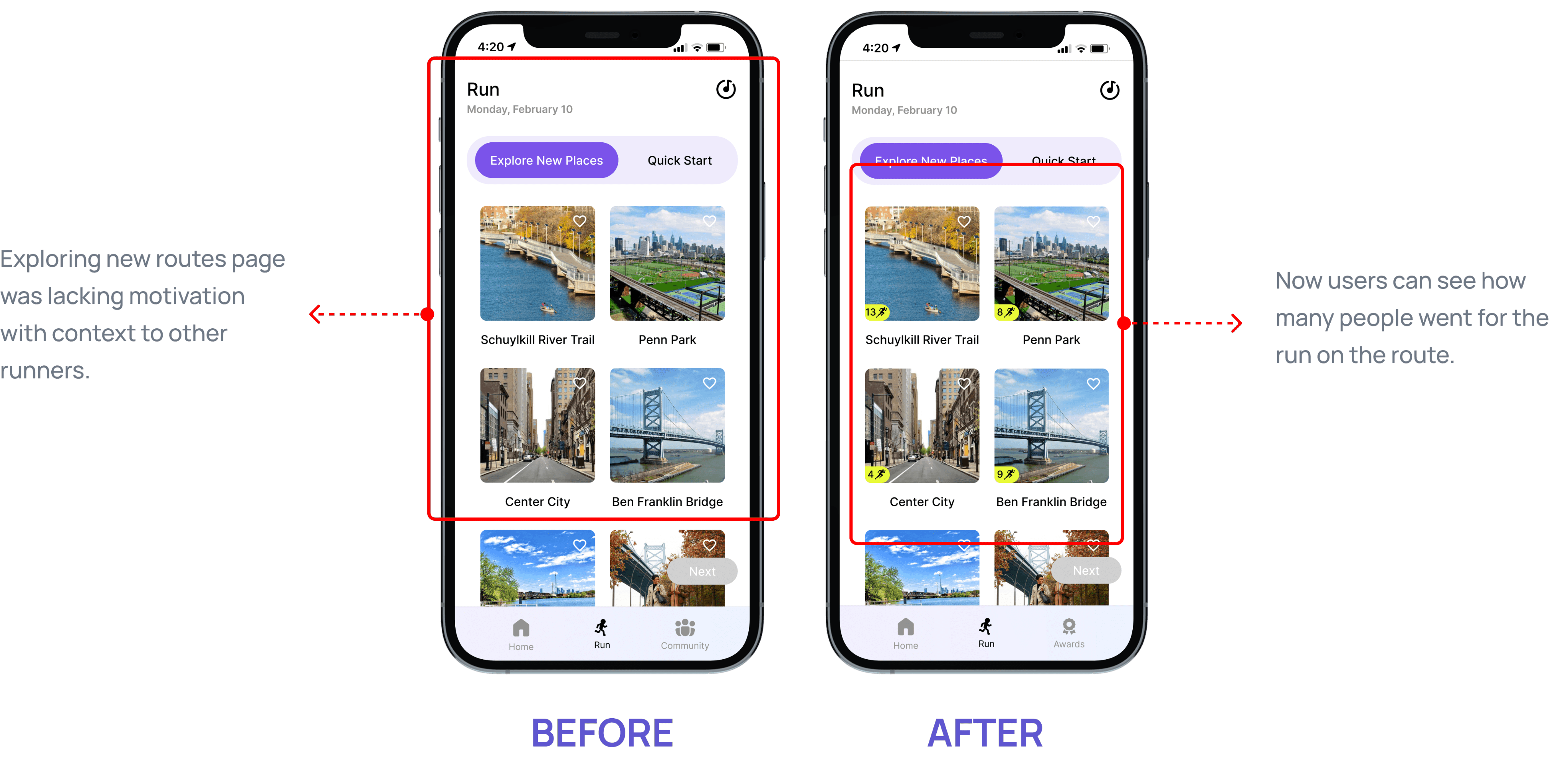
Explore New Places: SCAMPER - Combine
Key Takeaways
Users often offer surprising insights that reveal new opportunities for design improvements.
The features you’re most passionate about might not hold the same value for users.
Simple changes helped a lot- Just fixing labels or buttons made the app easier to use.
Clear words & terminologies matter- Confusing labels made people stuck, clear ones helped them move fast.