
DawnDash- 10 mins morning run app
OVERVIEW
Dawndash is a mobile app designed to help users build consistent morning running habit in just 10 minutes a day. The app focuses on habit formation, motivation, and ease of use.
I focused on creating a clean, user-friendly design that keeps things effortless. The goal was to make running feel achievable and rewarding.
MY ROLE
UX-UI Designer, Storyboarding, Visual Design, Style Guide, Prototyping, Wireframing, User flow and site mapping
TIMEFRAME
8 Weeks
TOOLS
Figma, FigJam, Miro
THE CHALLENGE
A significant challenge was creating an app that felt motivating yet simple, encouraging users to stick with their running routine without overwhelming them. Providing a smooth experience for users of all levels is another challenge. I had to carefully balance simplicity and motivation to keep users engaged.
PROJECT GOAL
The goal of the DAWNDASH app is to help users build a consistent habit of morning exercise by guiding them through a quick, 10-minute run, with a focus on habit formation, motivation, and user engagement for daily physical activity.
How might we design an engaging and simple 10-minute run experience that helps users boost their energy and form a consistent morning habit?
SOLUTION
The solution in the DAWNDASH app is to motivate users to develop a consistent morning exercise habit through a 10-minute run, while also offering rewards and points to keep users engaged.
Key Features:
10 mins run sessions
Progress tracking
Habit formation
Easy navigation

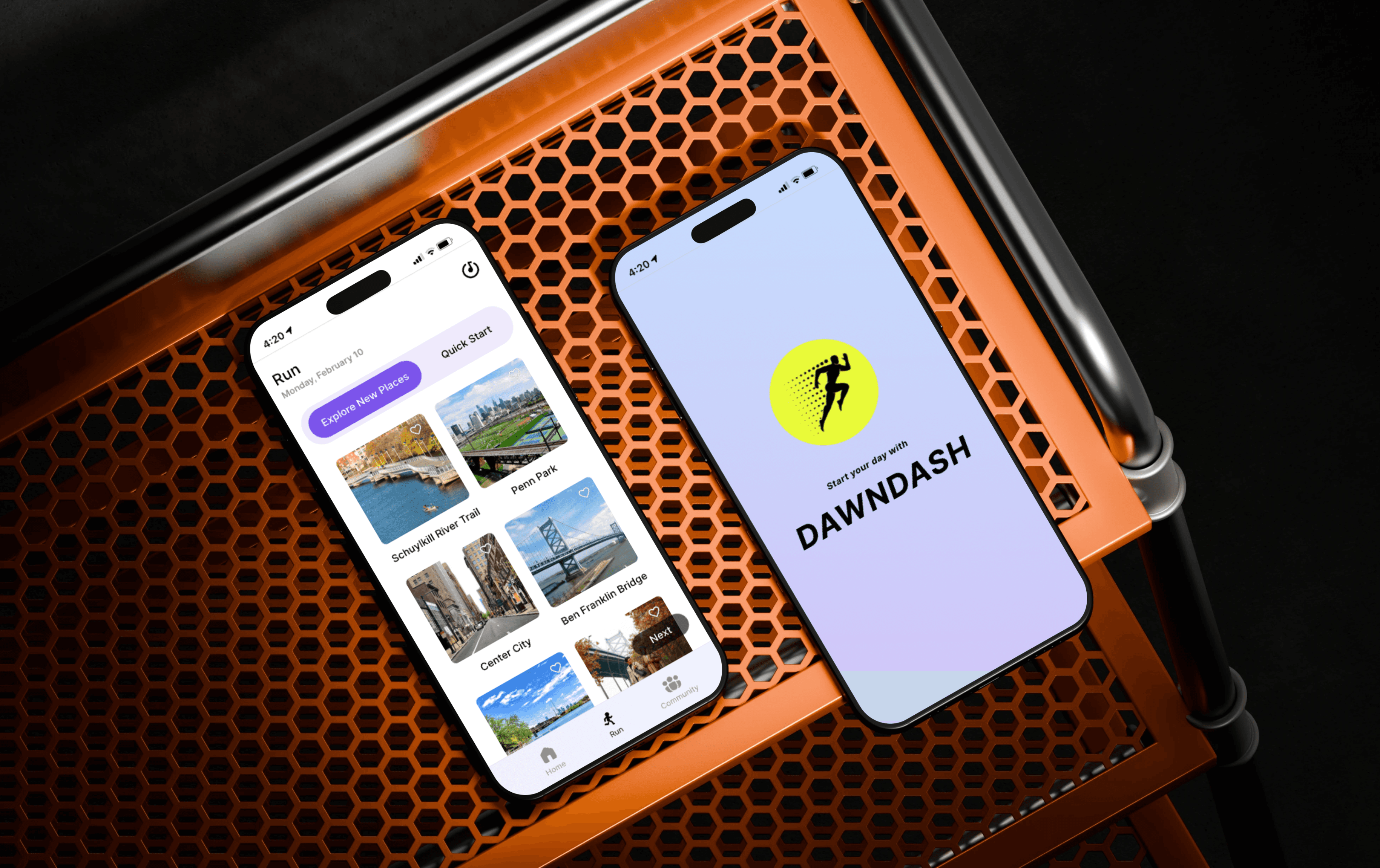
PRODUCT PROTOTYPE
Goal:
To help users establish a daily 10-minute morning run habit
Key Features Showcased:
Onboarding, progress tracking, and reward system
User Experience focus:
A seamless, intuitive interface designed for motivation and ease of use
View Prototype
DESIGN PROCESS
I used the Five Planes Design Process from The Elements of User Experience and the Double Diamond Model to develop DAWNDASH, incorporating four key elements of habit-forming products based on insights from the Hooked model.
The project was structured into five key stages following the Five Planes framework. After building the prototype.


Strategy
Secondary Research
Ideation
Story boarding
Scope
Kano Cards
MoSCoW
Structure
Information Architecture
User Flow
Site Map
Skeleton
Wireframe
UI Style Guide
Surface
Hi Fidelity UI Design
Prototype
Usability Testing
Abstract
Concrete
STRATEGY - Secondary research, ideation, storyboarding
Brainstorming with peers
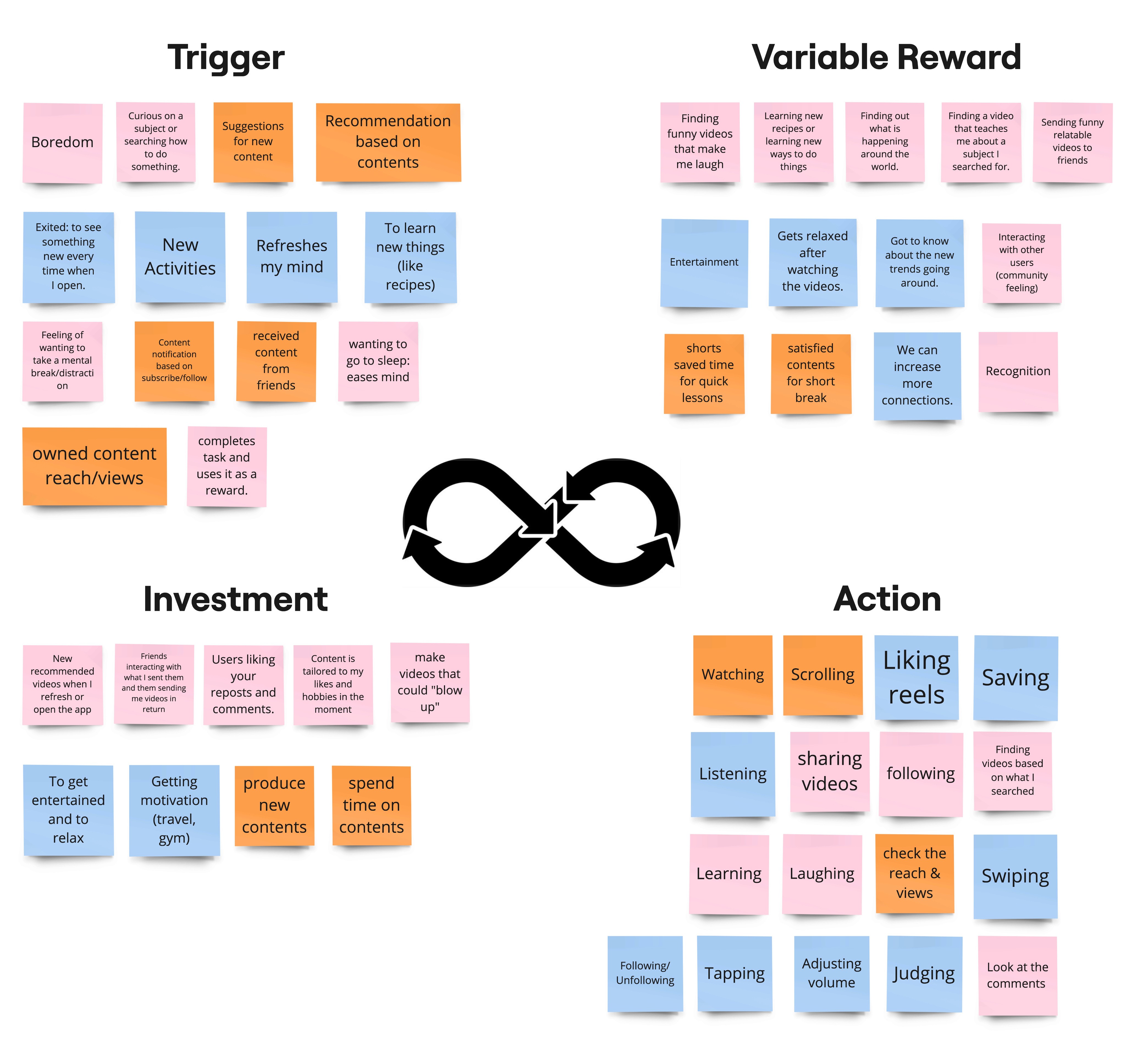
I applied the Hooked Model (Trigger, Action, Variable Reward, and Investment) to design a habit-forming app. Collaborating with peers, we analyzed common behaviors in similar apps and created an affinity map to connect these stages. This helped shape the app’s design to drive user engagement and long-term habit formation.
Story Board
After conducting secondary research, I created a storyboard to visualize user interactions and demonstrate how the Hooked Model (Trigger, Action, Reward, and Investment) drives habit formation. Each frame mapped key moments in the user journey, ensuring the app fosters long-term engagement.
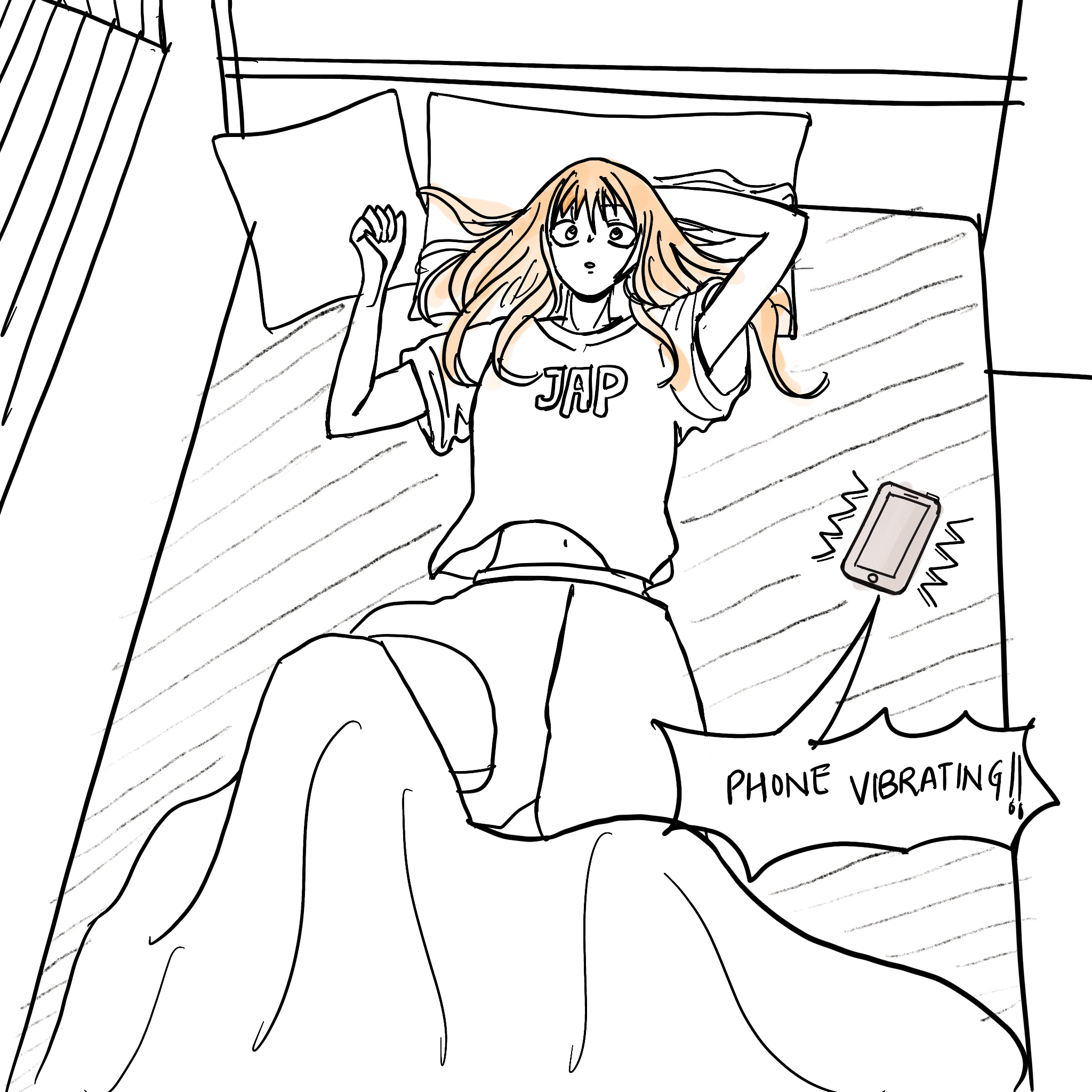
External Trigger
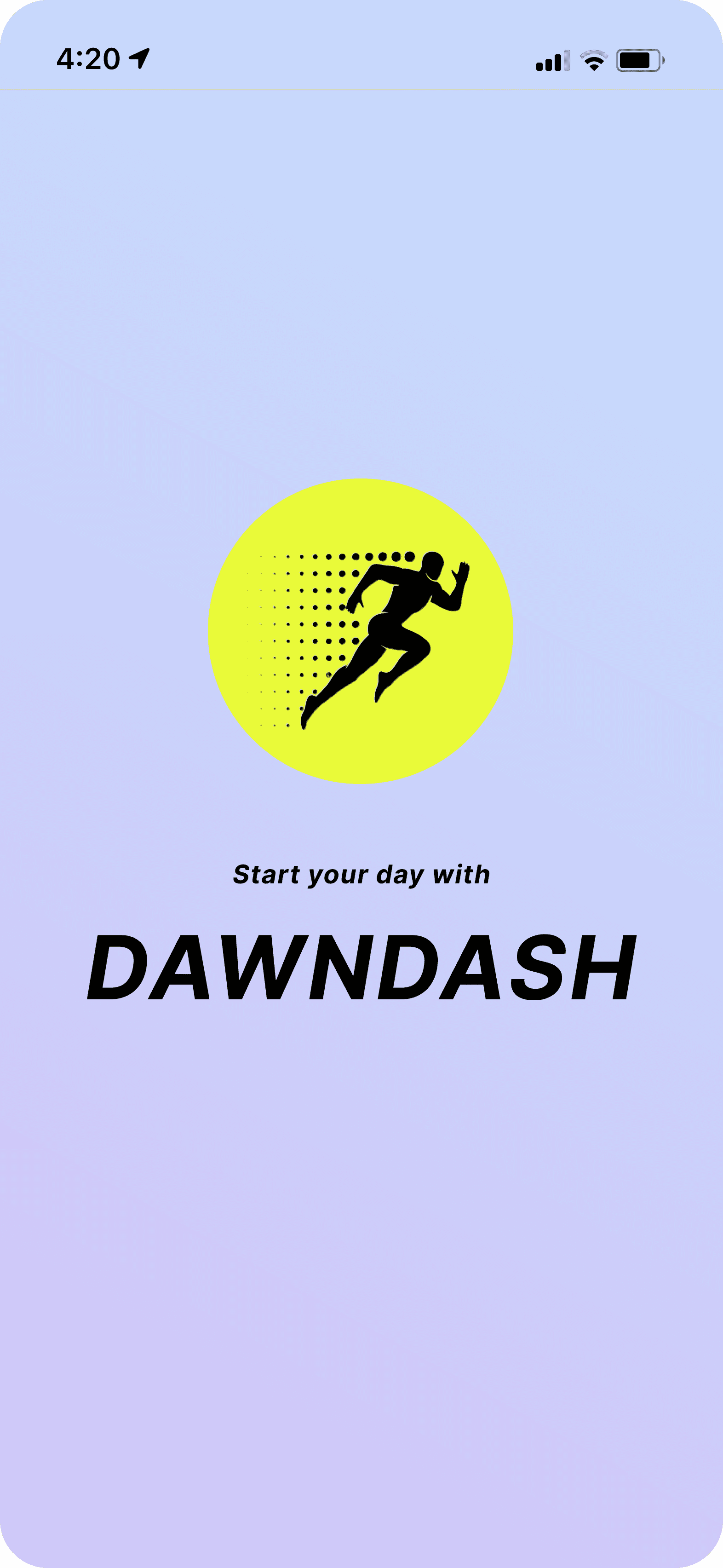
At morning, phone vibrates and Eva wakes up to check what is this sound of.
A smartphone screen lights up in the morning with a notification from Dawn Dash to get up and start running.
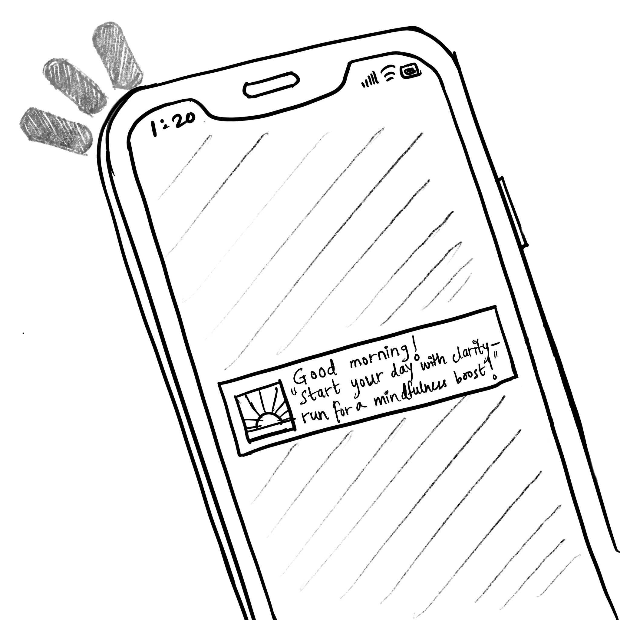
External Trigger
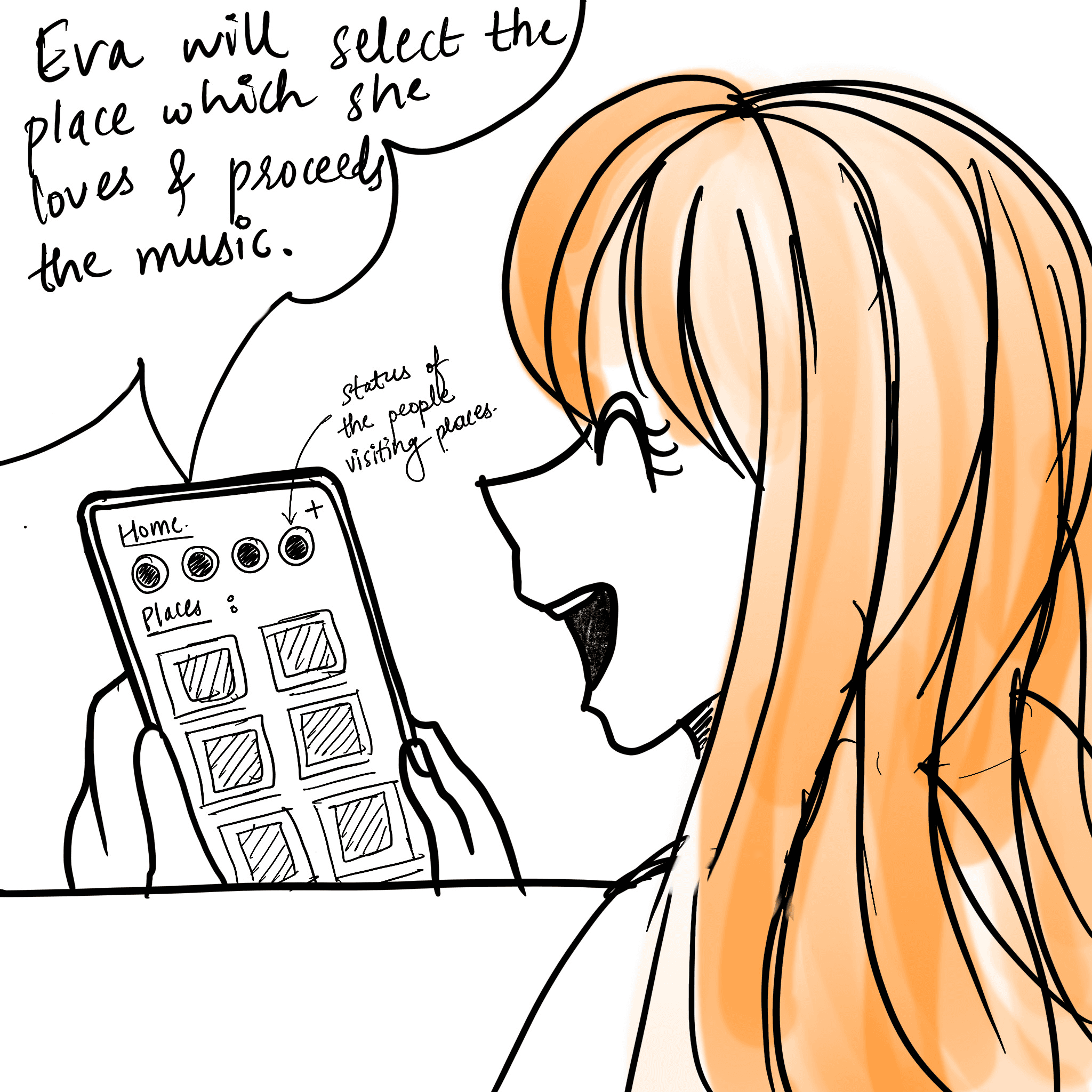
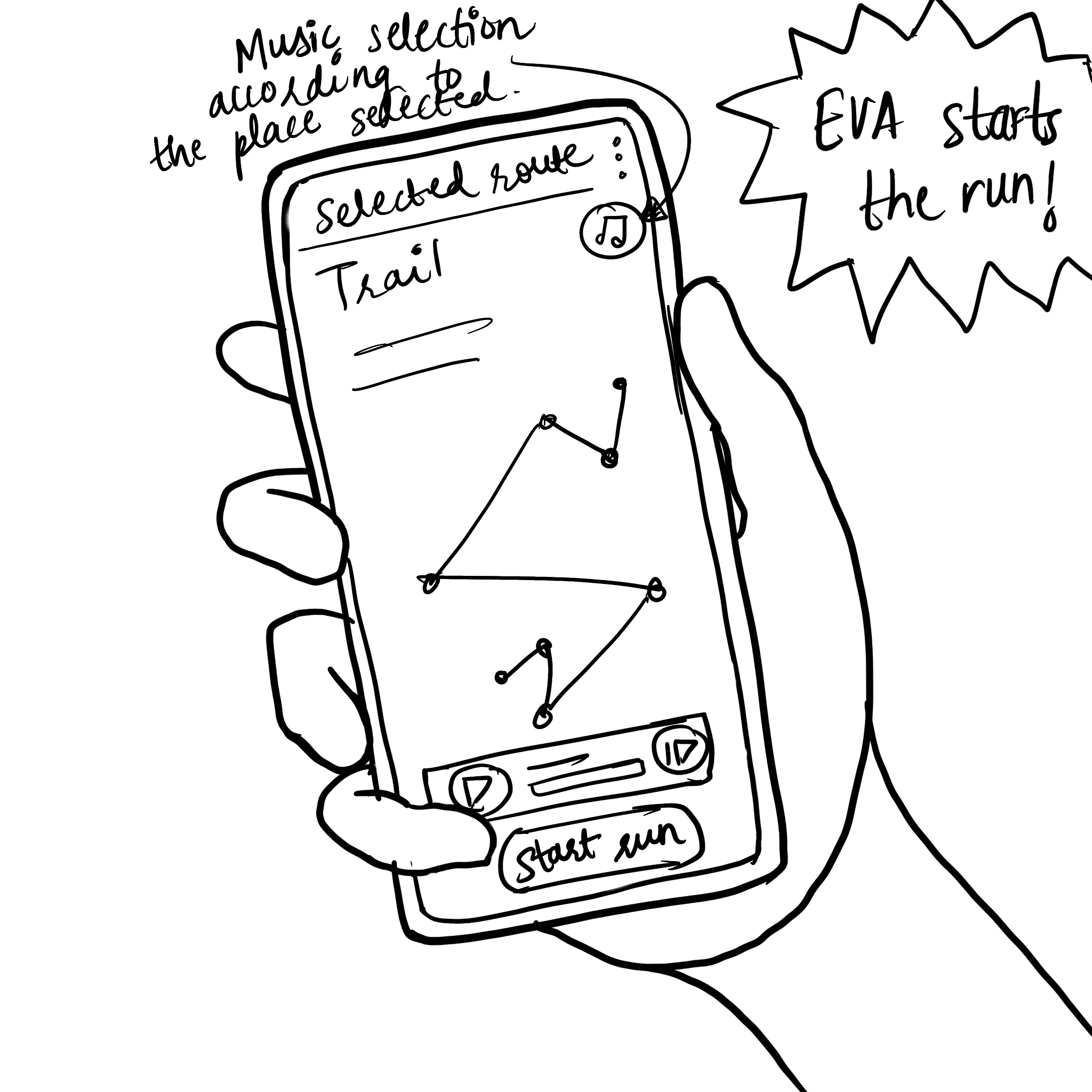
Action
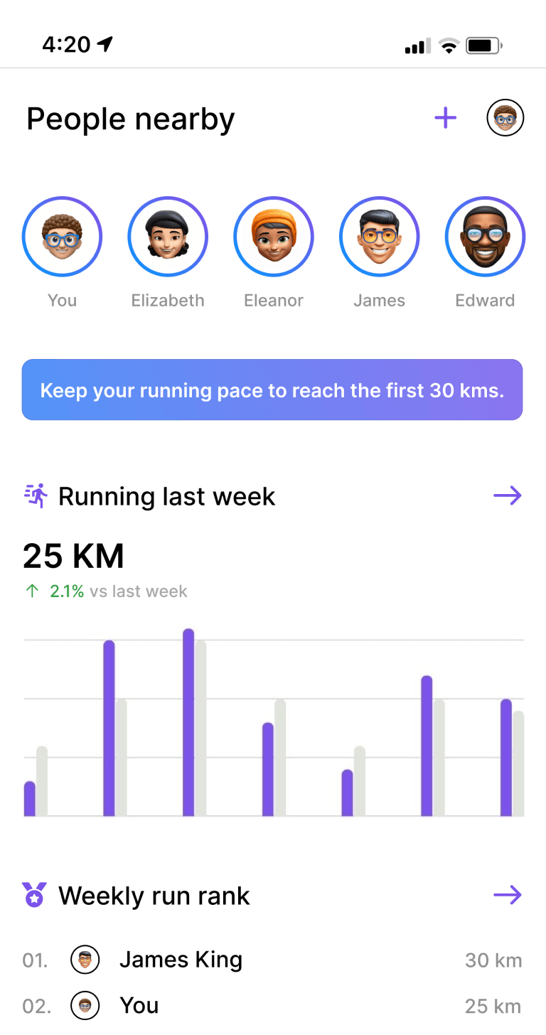
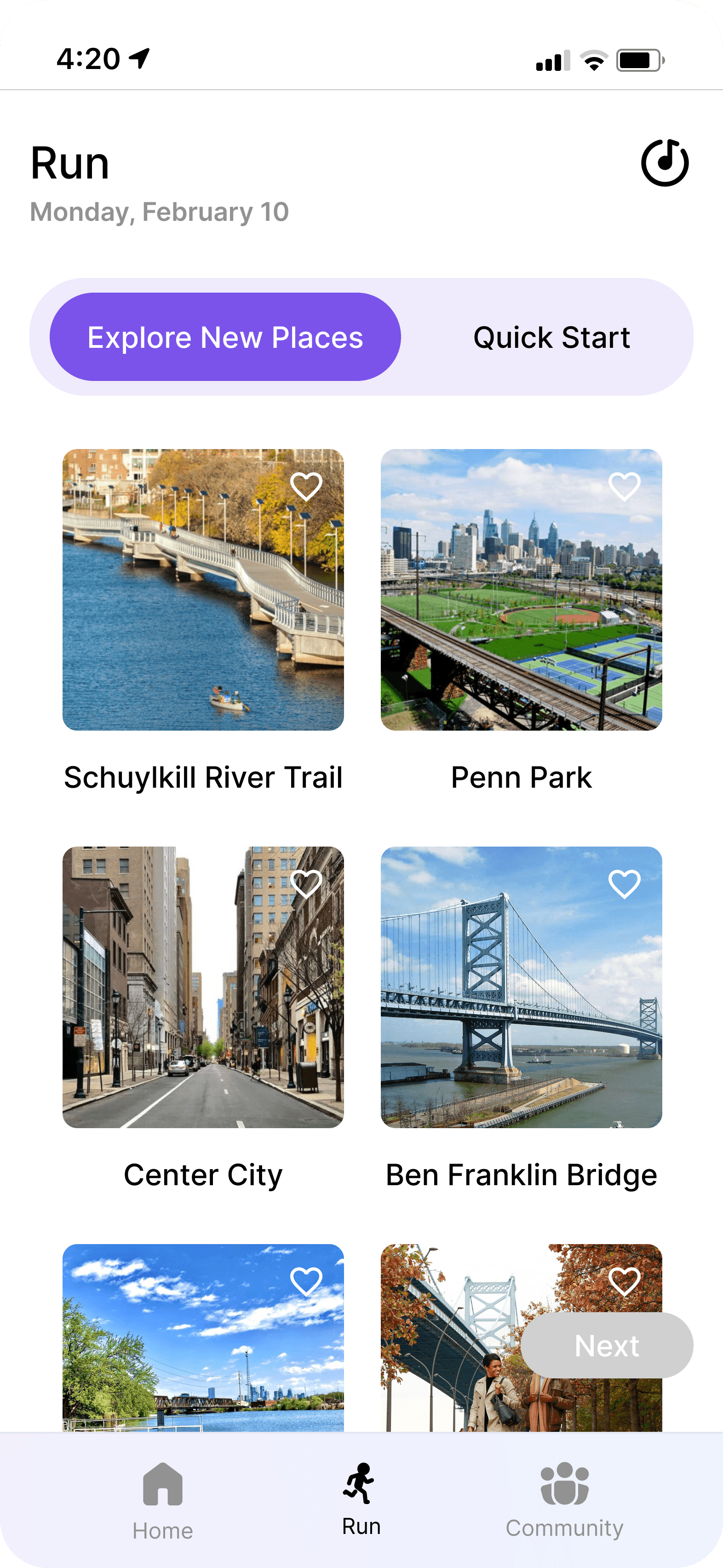
When she clicks on the notification, the app’s home screen displays nearby scenic places with highlights of the people where they upload their photos of the run.
Eva starts running through the trail which she selected and feels fresh while running.
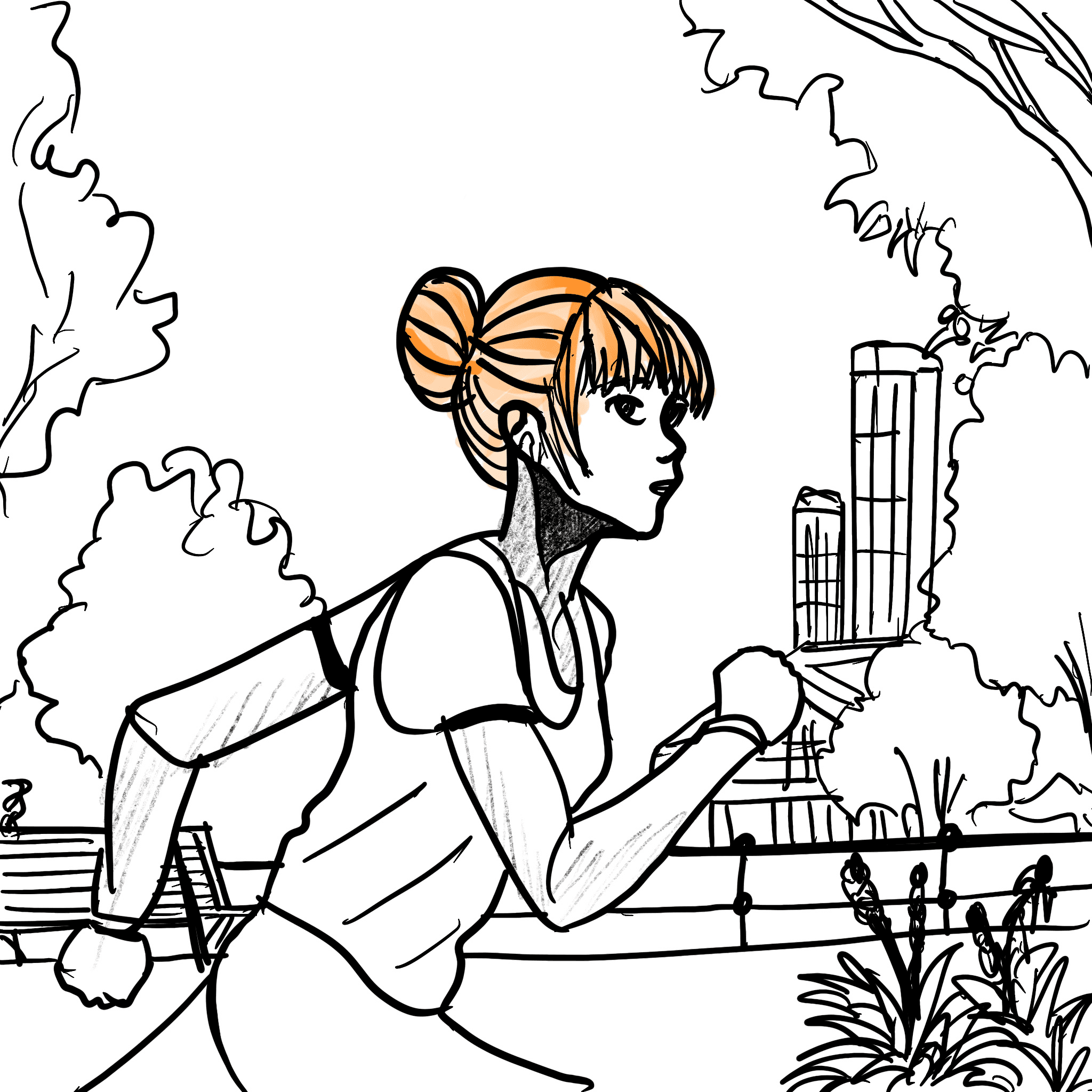
She finally completes her 10 mins run covering 2 kms and clicks photo of the sight and uploads like other people, which was tracked by the GPS.
Action
Eva Selects the route, the music she likes and starts to run. The GPS tracks how much kms she covers in 10 mins..
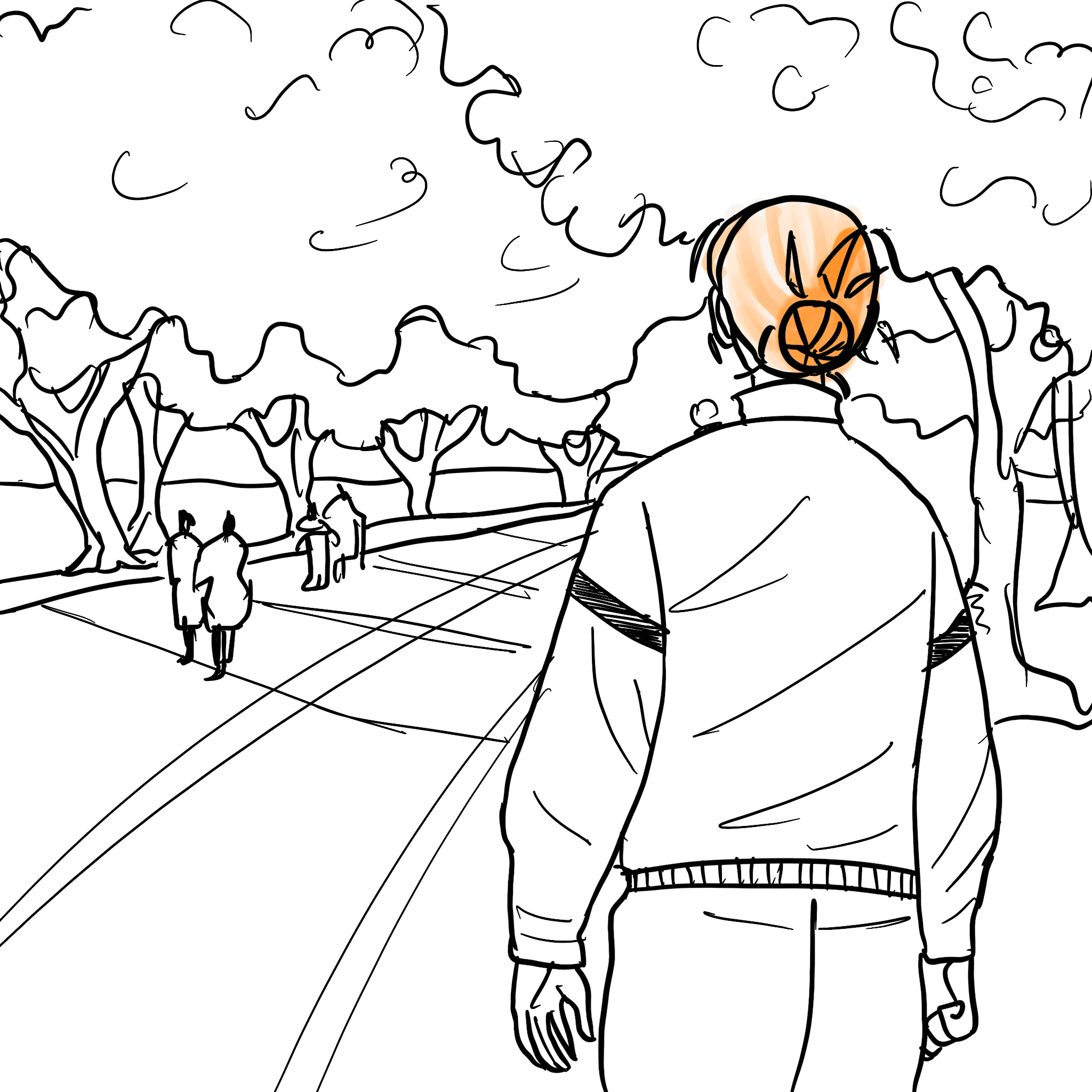
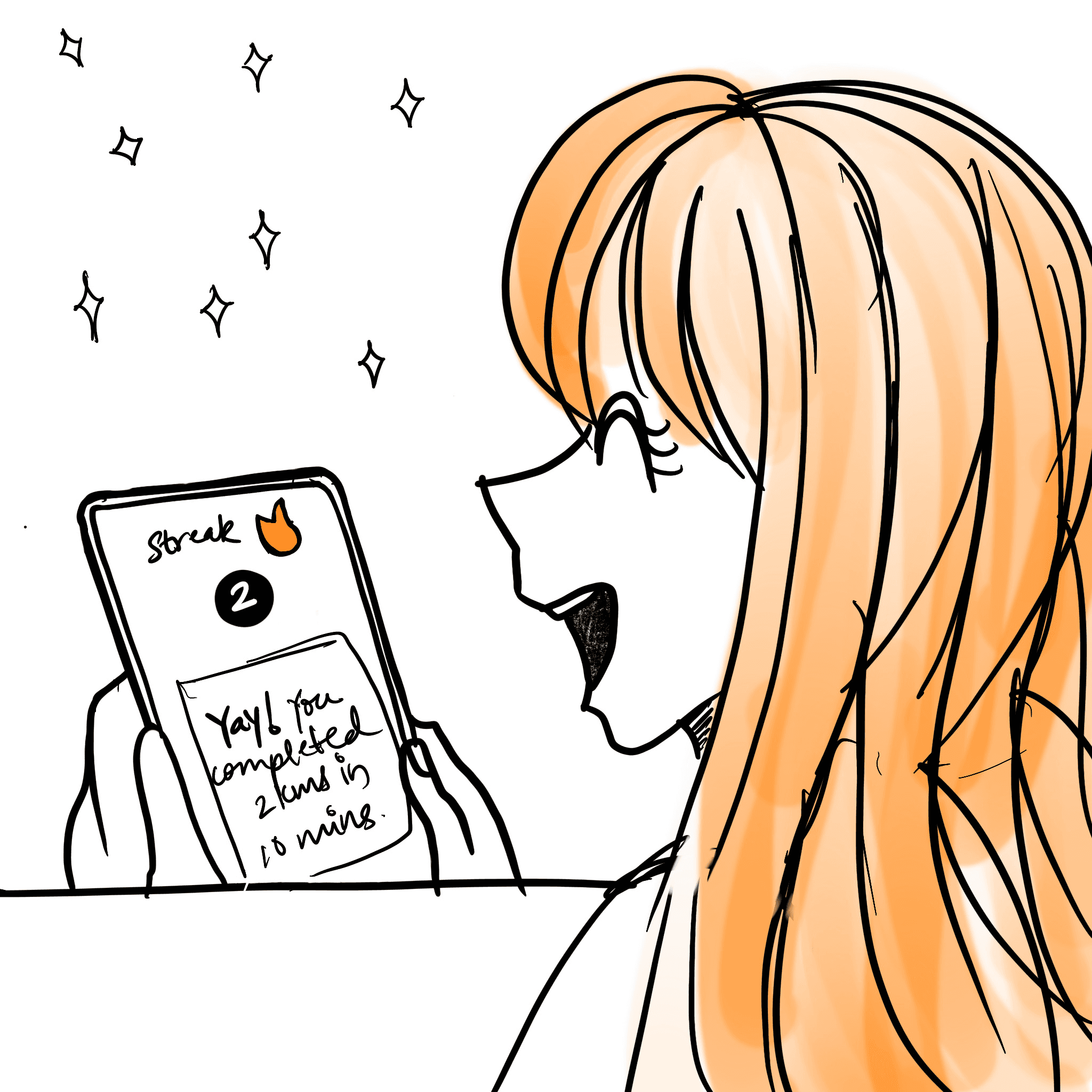
Reward
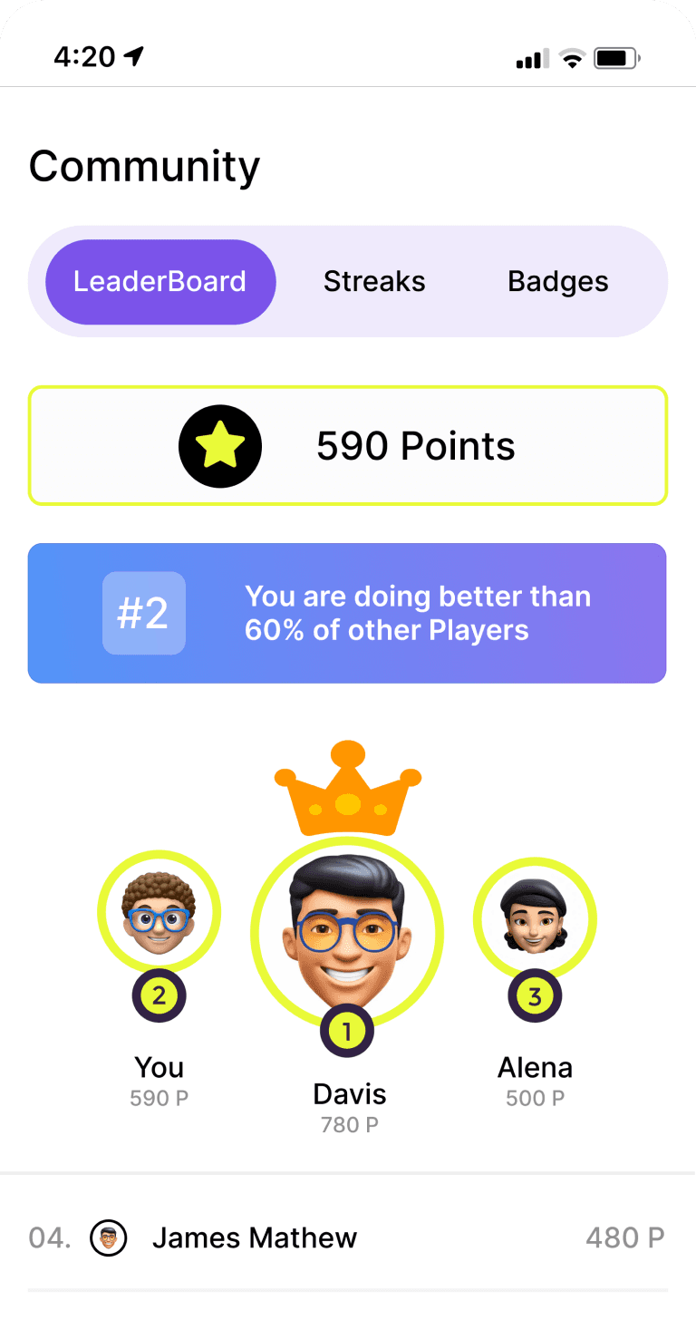
Eva gets a message that she ran 2 kms in 10 mins in todays run with the streaks.
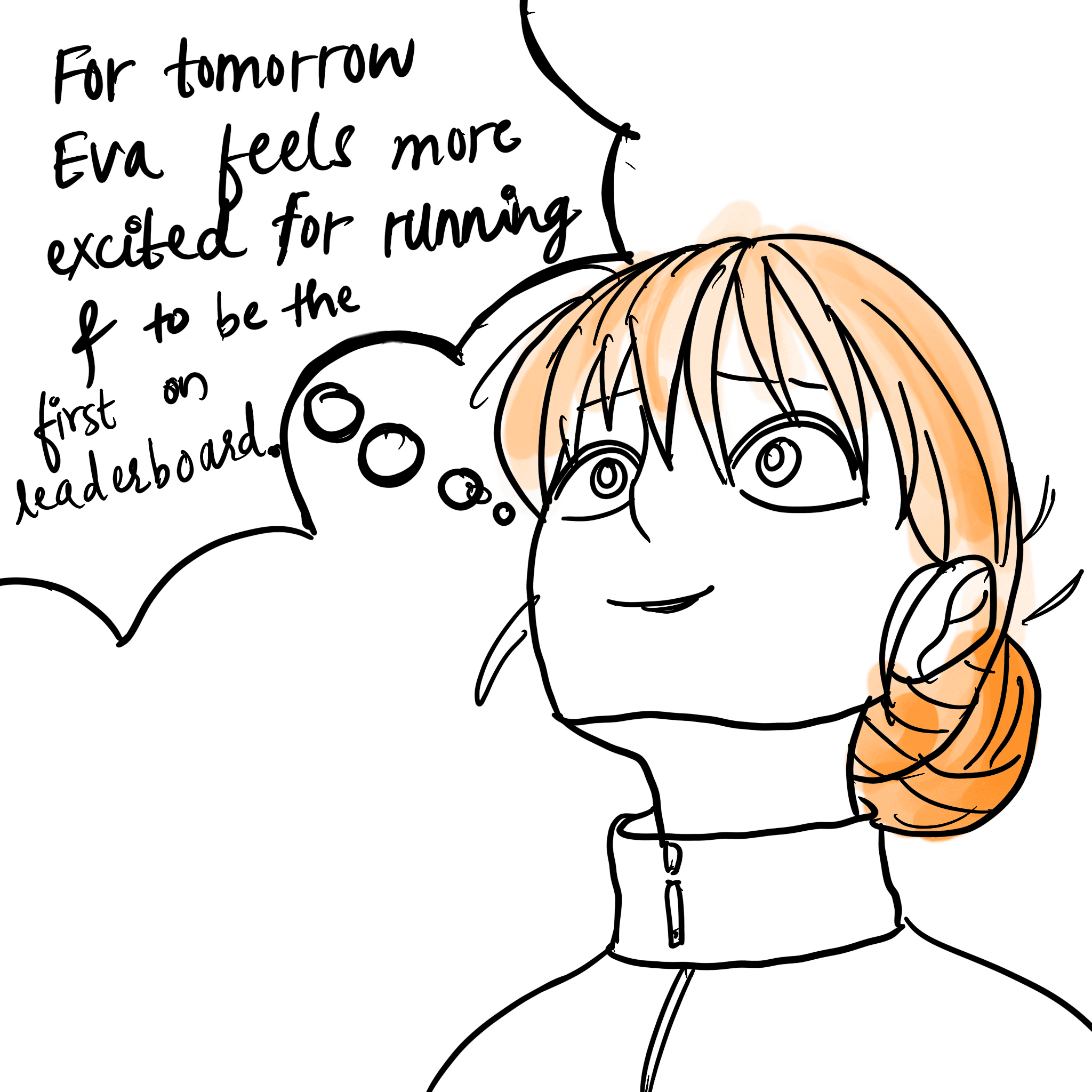
Investment
She feels excited about completing tomorrow's run and be the first again to cover the most distance.
The app displays a leaderboard with the streaks, awarding her for finishing first in the community by covering more kms than other people on her first day.
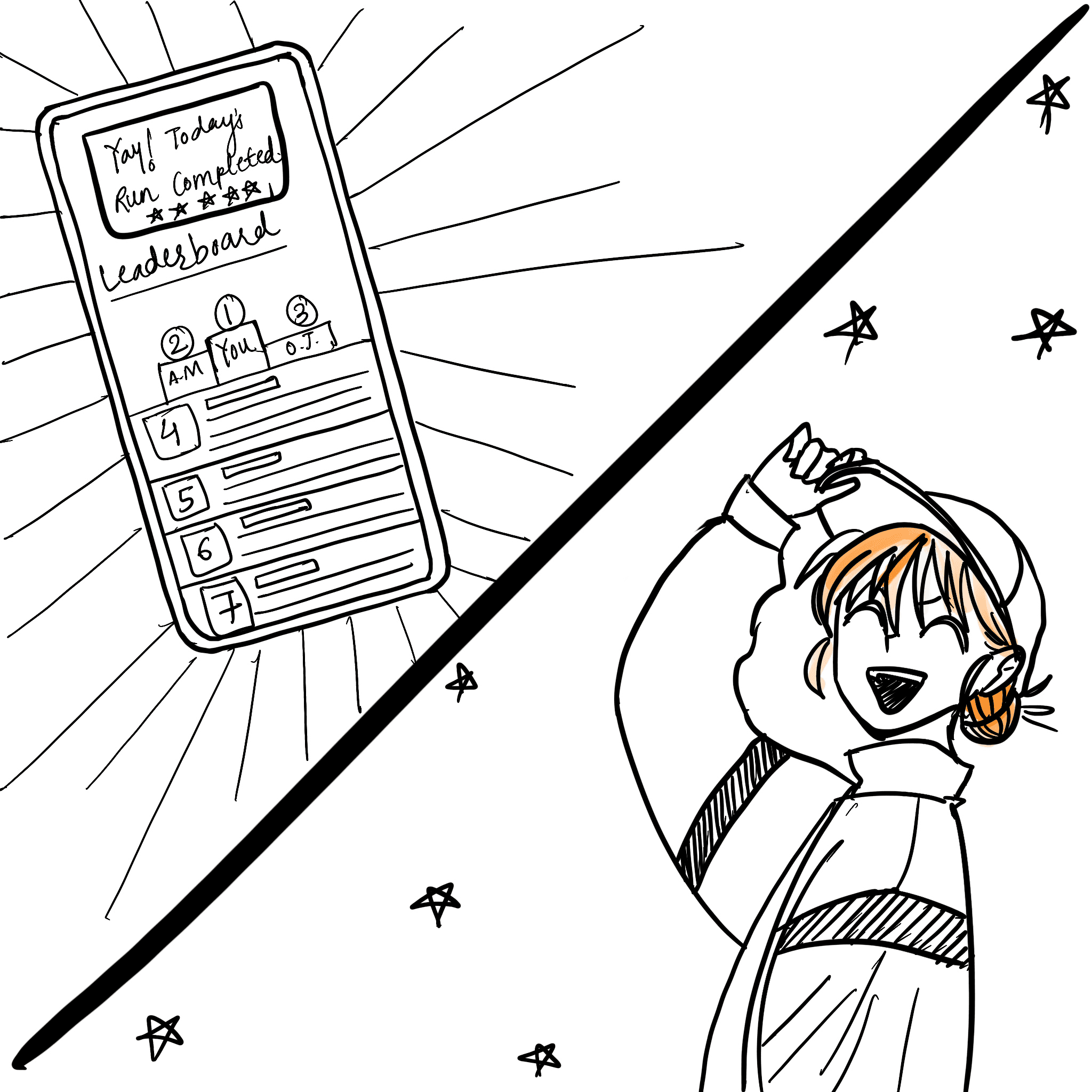
Reward
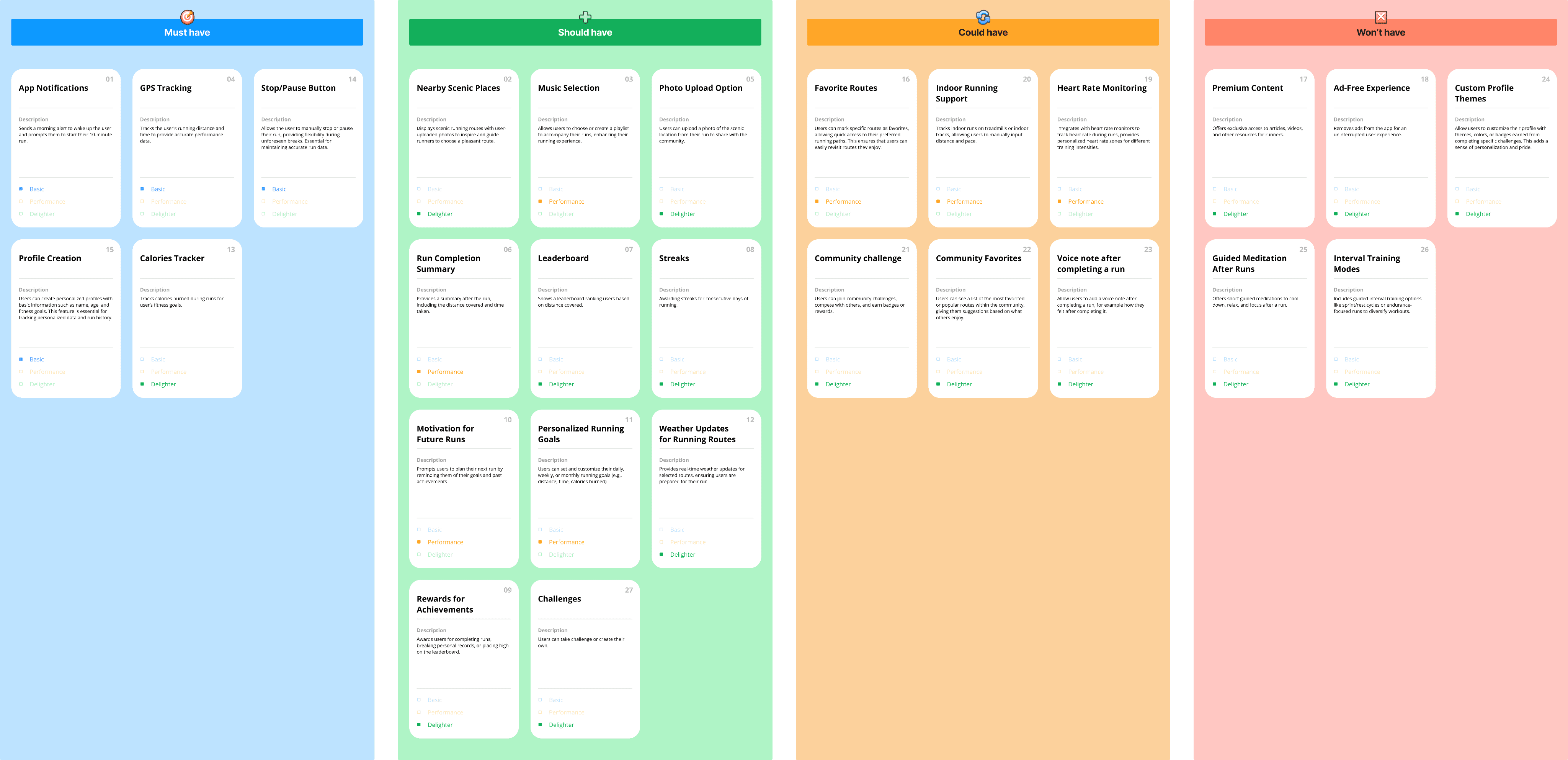
SCOPE - Kano cards, MoSCoW
MoSCoW
I used MoSCoW analysis to prioritize features for the MVP, focusing on Must-Haves and Should-Haves to ensure core functionality. Could-Haves were set aside for future updates, while Won’t-Haves were removed to keep the design focused and efficient.
STRUCTURE - User flow
Userflow
I designed the user flow to visualize navigation, map the user journey, and identify friction points, ensuring a seamless and engaging experience.
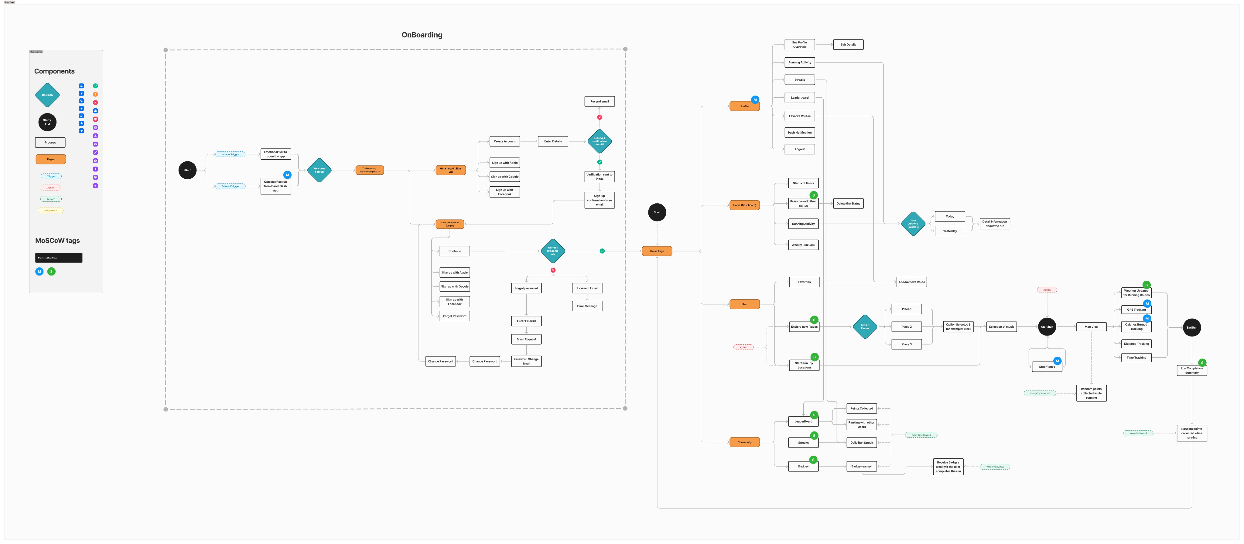
View UserFlow
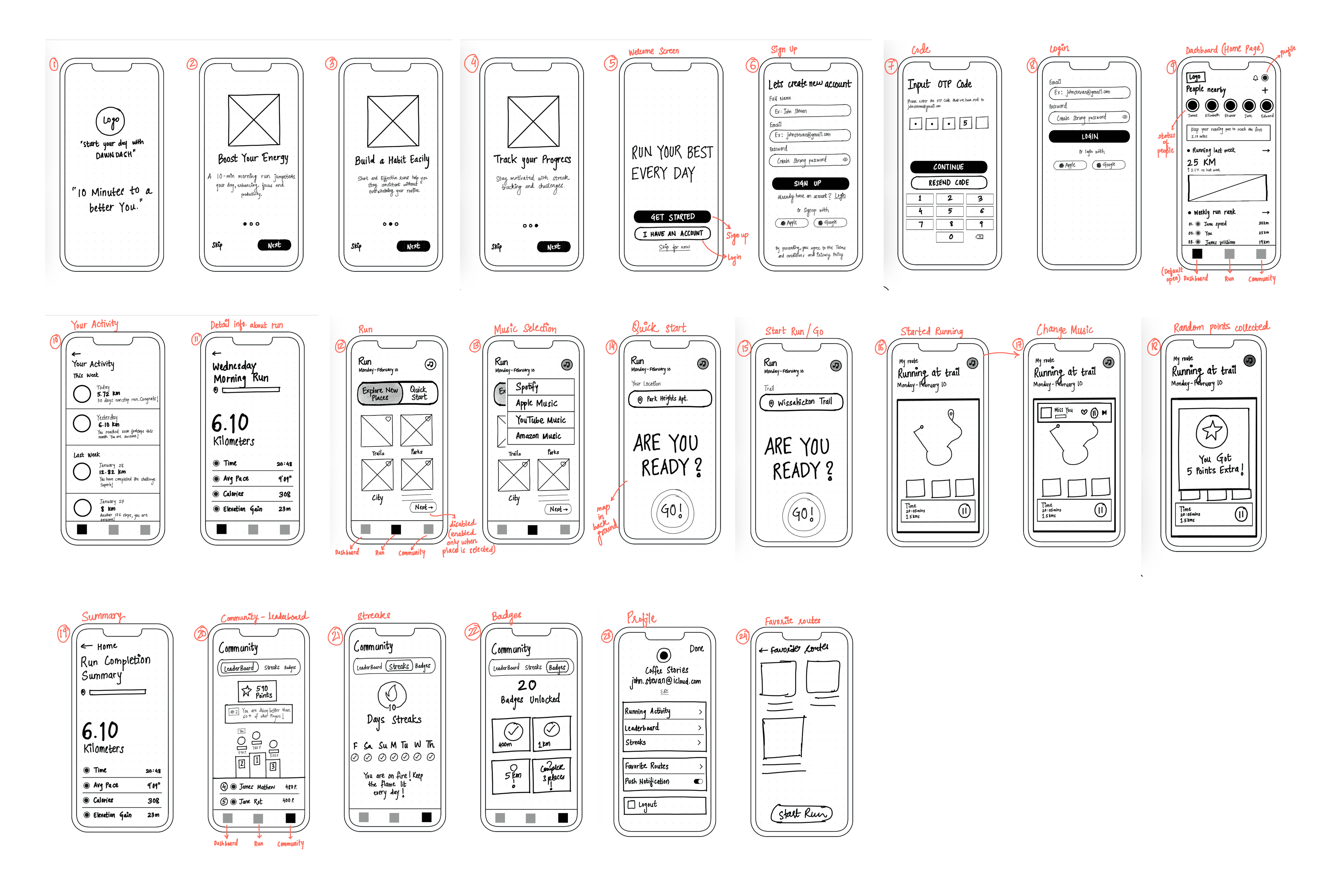
SKELETON - Wireframes, UI Style Guide
Wireframes
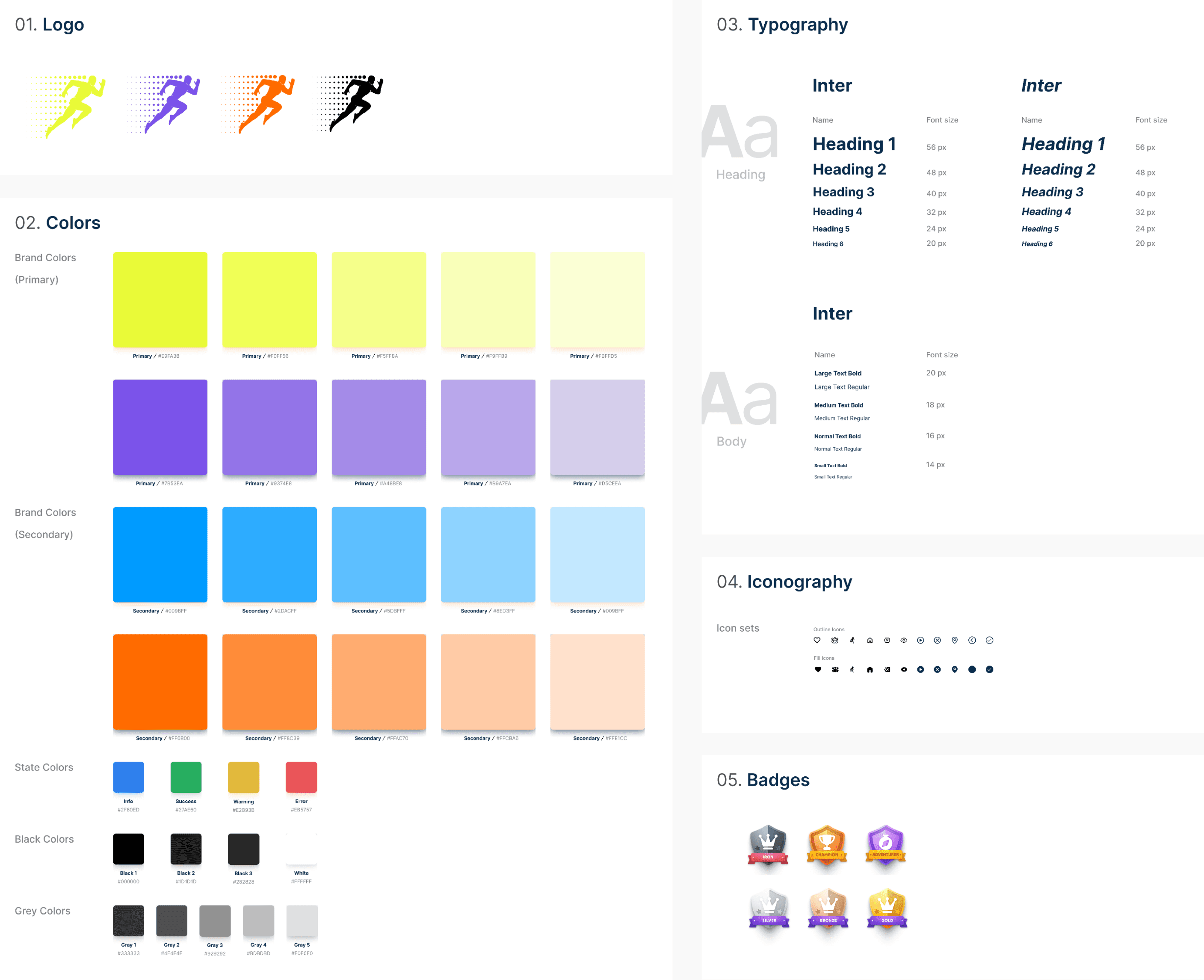
Style Guide
SURFACE - High Fidelity Designs
High Fidelity Designs
The high-fidelity designs bring the final visual and interactive elements of DAWNDASH to life. These designs reflect the polished UI, incorporating typography, color schemes, and detailed components to create a seamless user experience. The screens showcase the core features, ensuring clarity, engagement, and ease of navigation.
Go to Usability Testing
Key Takeaways
Applying the Hooked Model helped design an experience that encourages long-term user engagement.
Using MoSCoW analysis ensured the MVP focused on essential features, streamlining development while leaving room for future improvements.
Mapping out user flows and screen flows early on helped refine navigation and create a seamless experience.
A polished UI with a clear visual hierarchy and intuitive interactions ensures an engaging and user-friendly experience.