
Dominix Global Design- Design company website
OVERVIEW
I developed an in-house website for Dominix Global Design Company. My goal was to create a smooth, user friendly experience hat made navigation effortless d improved internal workflow.
MY ROLE
UX-UI Designer, Secondary research, Competitive analysis, Visual design, Style Guide, Prototyping and testing
TIMEFRAME
16 Weeks
TOOLS
Figma, FigJam, Google forms
THE CHALLENGE
The original website was outdated and lacked usability, o I rebuild everything from scratch. One major challenge was understanding internal needs and redefining the websites structure. I had to balance aesthetics with functionality. Additionally, collaborating with everyone, including developers was a key part of the process.
PROJECT GOAL
The goal was to redesign and rebuild the Dominix Global Design in-house website from scratch, replacing the outdated version with a more user-friendly, responsive, and visually appealing platform. The focus was on improving usability, navigation, and internal workflow efficiency.
PROJECT BRIEF
Create a website for a design firm that is easy to use, appealing to prospective customers, showcases the company's portfolio, and is functional for them.
BACKGROUND STUDY
The company's current website lacks user-friendly navigation and modern design elements, resulting in a high bounce rate and decreased user engagement. With the increasing competition and evolving consumer preferences, it's imperative to revamp the website to enhance user experience, improve brand perception, and align with the company's strategic goals of expanding online presence and increasing customer conversion rates."
WEBSITE GOALS
50%
Work speaking aloud + User experience & engagement
30%
Maintaining relationships
10%
Aim to convert
visitors into leads
or customers
10%
Communicating a Brand Identity
METHODOLOGY DIAGRAM
Scrutiny of current website
Clientele list
Process flow
Research
Combine Takeaways
Wireframes
Competitive analysis
Theme board
Persona study
Design System
Trends study
UI design
Interactions
Project Brief
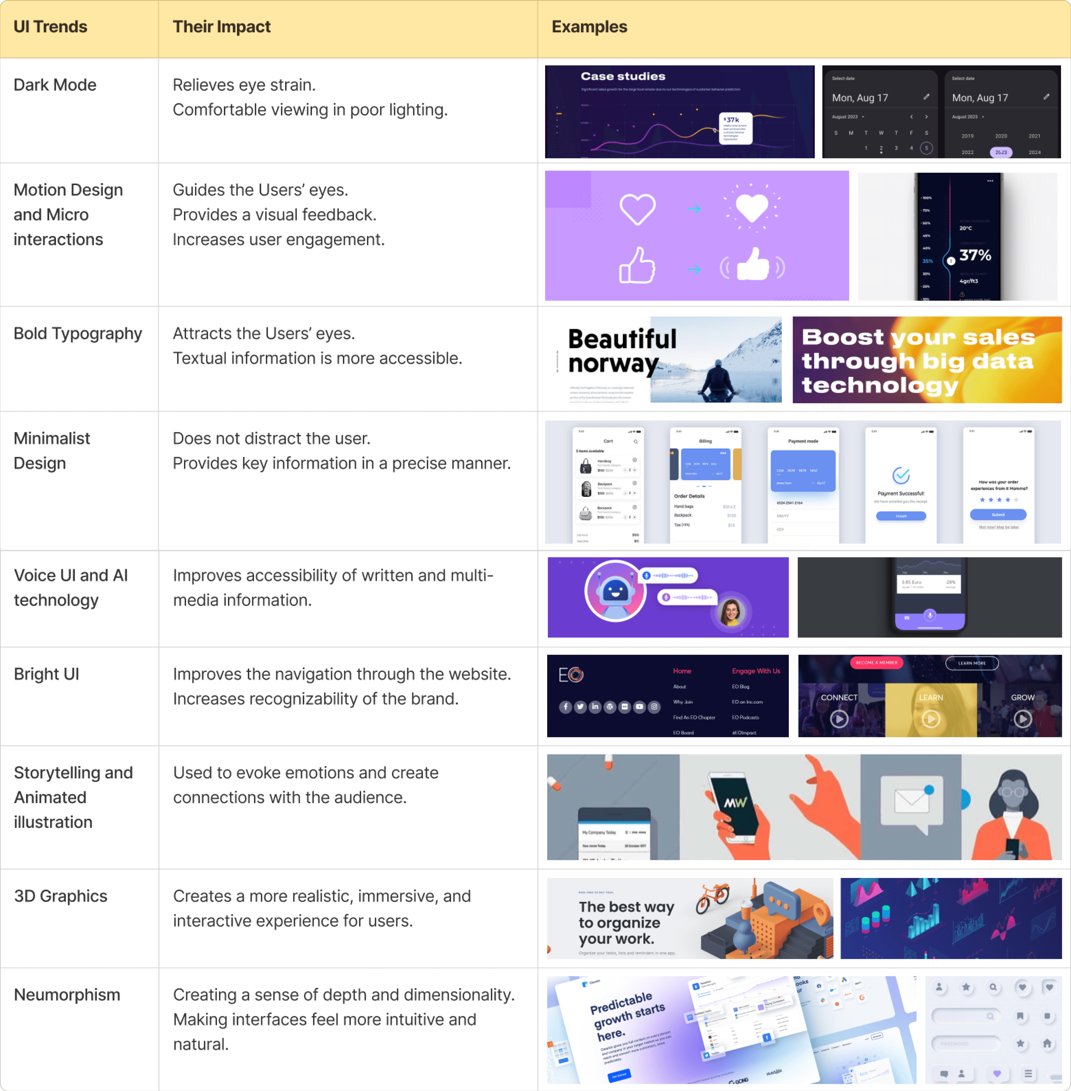
CURRENT UI TRENDS
I studied current UI trends to create a visually appealing, user-friendly, and engaging website. By incorporating modern design elements like dark mode, motion interactions, bold typography, and minimalist layouts, the website enhances usability, accessibility, and brand identity while delivering a seamless user experience.
COMPETITIVE ANALYSIS
To understand industry standards and best practices, I conducted a competitive analysis of 10 leading design firm websites, including Designit, The Design Trip, Kaizen Design Studio, and Elephant Design. The analysis focused on key aspects such as usability, navigation, branding, accessibility, and user engagement.
Designit is a global design agency based in Copenhagen, Denmark, specializing in user-centered experiences across sectors like aviation, public transportation, and beauty. They focus on innovative and inclusive design solutions.


Parameters
WHAT IT REPRESENTS
Colour scheme
Usability
Navigation
Content &
readibility
Simple black and white which
looks very neat.
Users find what they're looking for and complete their desired tasks easily.
Intuitive, clear, and user-friendly.
Knowledge delivered beautifully, one sentence at a time.
Highlights
Branding placement
Functionality
Uniqueness
Main focus on work.
Top left corner and optimal positioning of the logo.
Functionality simplifies, not complicates.
By starting directly with the work which is important from clients perspective.
View Competitive Analysis
DOMINIX ANALYSIS
What do potential international clients look for in a design firm ?
1
Expertise & Skillset
2
Quality of Work
3
Industry Experience
4
Cultural Sensitivity
5
Cost-effectiveness
6
Technological Proficiency
7
References and
Testimonials
6
Communication
and Collaboration
Dominix is a global design and innovation company which pushed the world forward by creating impact through design. Dominix Group is the only Group in the world providing holistic services in Brand+ Business, Industrial Design & Manufacturing, Space Design & Development and Digital Design & Software.

Start - up Companies
Well- established companies
Mid - level Companies
I
Personas

II
Category the UX focuses on
Brand
Service
Product
Experience
III
Type of Work
Graphic Design
UI/UX Design
Industrial Design
FINDINGS FROM THE ANALYSIS
1
Brand
Language
Brand language can be depicted in a smooth and effective manner throughout the website.
2
User
Flow
The user flow should be Smooth and consistent (from the first step towards the final action)
3
UX
Copy
The user should be provided with information that should be both accessible, legible, easy to understand and of high quality, meeting their expectations.
4
User
Interface
Should have simple and user-friendly navigation.
Accessibility : There should be sufficient contrast and size ratio. The information should be legible and the icons should be standard
5
User
Engagement
Implement interactions to encourage users to engage further by scrolling through the website.
6
User
Experience
There is a scope of improvement to enhance the user experience of the client while scrolling through the website.
PAIN-POINTS
The current website has several usability and functionality challenges that impact user experience and navigation. Addressing these pain points will help improve accessibility, efficiency, and overall engagement.

Work and process details are missing.
Buttons redirect directly to mail instead of relevant pages.
Transparent buttons reduce clarity and usability.
Some buttons incorrectly link back to the homepage.
Poor page linking affects navigation.
Excessive content overload due to a single-page structure.
New features that can improve the
website’s value
Implementing these features will enhance usability, strengthen brand identity, and create a more interactive and engaging experience for users.
Contact Section on Every Page – Enhances accessibility for users.
Highlight Design Team – Fosters trust and collaboration.
Showcasing Upcoming Projects – Keeps clients engaged.
Work Locations Map – Builds credibility and global reach.
Subtle 3D Effects – Adds depth without clutter.
Gradients – Enhances visual appeal and direction.
USER FLOW
I designed the user flow to visualize navigation, map the user journey, and identify friction points, ensuring a seamless and engaging experience.
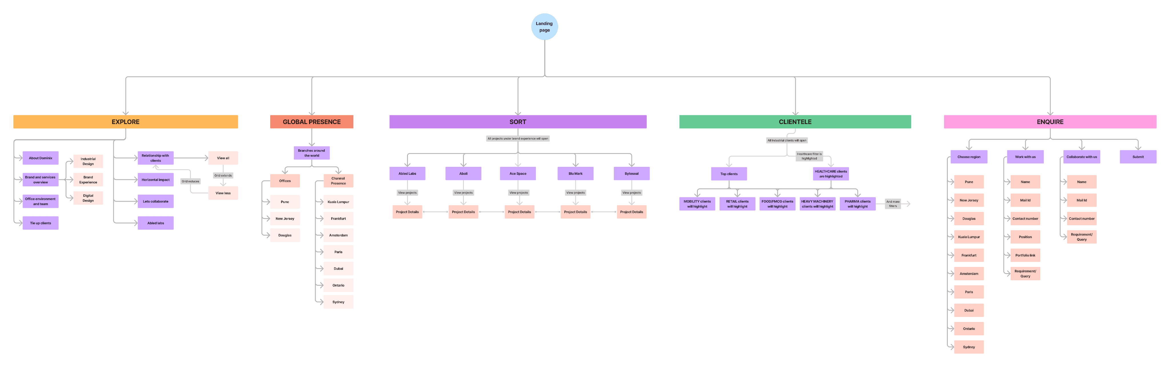
View User Flow
USER TESTING SCREENS & USER TESTING
User testing screens
This section presents three initial landing page layouts focused on top navigation. It includes user testing insights, feedback, and key takeaways to guide the final implementation.
Layout 1
Layout 2
Layout 3
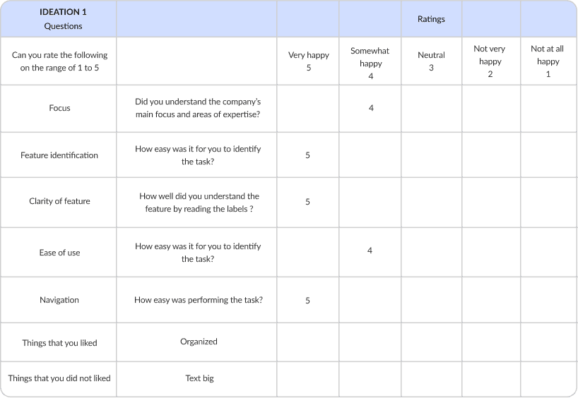
User testing
I conducted 10 user testings for all the 3 ideations one by one.
User 1
Ideation 1, 2 and 3
Task 1 - Dominix website top navigations.
Analyzing the functionality of the application to complete a task.
View User Testings
Statistics
Took out the average of all the ideations ad †hese are the insights:
Ideation 1
Average rating: 4.22
Percentage: 84.4%
Ideation 2
Average rating: 4.08
Percentage: 81.6%
Ideation 3
Average rating: 3.92
Percentage: 78.4%
LOW Fidelity Wireframes
The low-fidelity wireframes provide a basic structural layout of the website, focusing on content placement, navigation flow, and user interactions. These initial sketches help visualize the core functionality and user journey before moving into detailed design and high-fidelity prototypes
Low Fidelity Wireframes
STYLE GUIDE
Colors
Primaries and grays
BLUE
#052CFA
BLUE JEANS
#62AAFF
#000000
#1F1F1F
#464646
#888888
#FFFFFF
Typography
Lato
Libre Baskerville
abcdefghijklmnopqrstuvwxyz
ABCDEFGHIJKLMNOPQRSTUVWXYZ
0123456789 ~!@#$%^&*()[],.
abcdefghijklmnopqrstuvwxyz
ABCDEFGHIJKLMNOPQRSTUVWXYZ
0123456789 ~!@#$%^&*()[],.
Aa
Regular
Aa
Medium
Aa
Bold
Aa
Regular
Aa
Medium
Aa
Bold
Lato (heading, body text)
h1, 30, bold
Lorem ipsum dolor
b1, 22, bold
Lorem ipsum dolor
h2, 22, regular
Lorem ipsum dolor
h3, 20, Medium
Lorem ipsum dolor
h4, 16, bold
Lorem ipsum dolor
h5, 16, regular
Lorem ipsum dolor
b2, 15, bold
Lorem ipsum dolor
b3, 15, regular
Lorem ipsum dolor
b4, 14, regular
Lorem ipsum dolor
b5, 13, light
Lorem ipsum dolor
b6, 12, bold
Lorem ipsum dolor
b7, 12, medium
Lorem ipsum dolor
b8, 12, regular
Lorem ipsum dolor
b9, 10, regular
Lorem ipsum dolor
Libre Baskerville (heading)
h1, 60, bold
Lorem ipsum dolor
h6, 45, bold
Lorem ipsum dolor
h6, 45, regular
Lorem ipsum dolor
h7, 32, bold
Lorem ipsum dolor
h7, 30, bold
Lorem ipsum dolor
h7, 30, regular
Lorem ipsum dolor
h6, 28, regular
Lorem ipsum dolor
h6, 24, regular
Lorem ipsum dolor
DESIGN OUTCOMES
A. Laptop Version
Product details with high-quality images.
Filtering and search capabilities for seamless browsing.
Optimized layout for widescreen viewing and professional appeal.
View Prototype


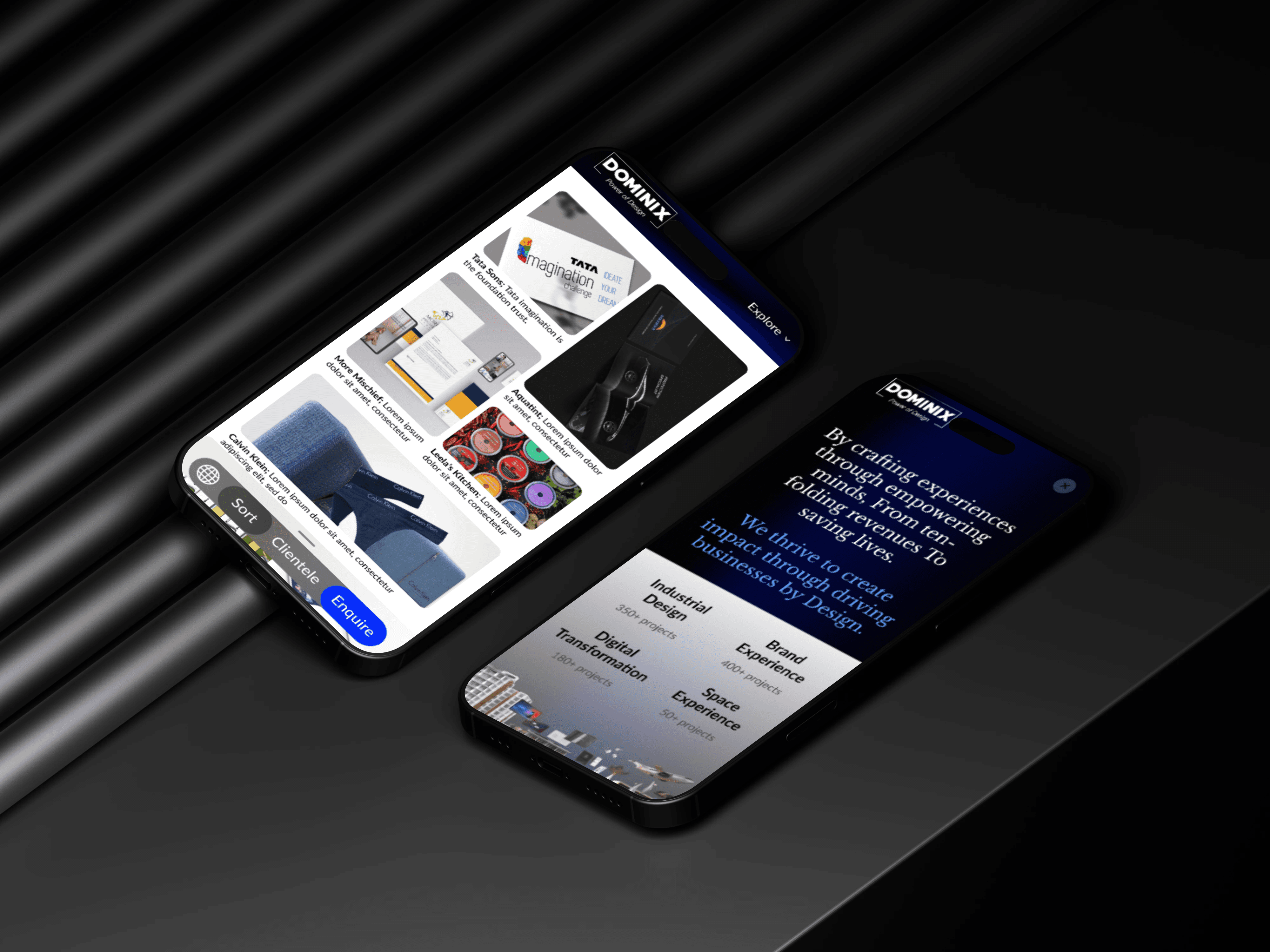
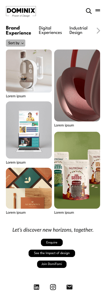
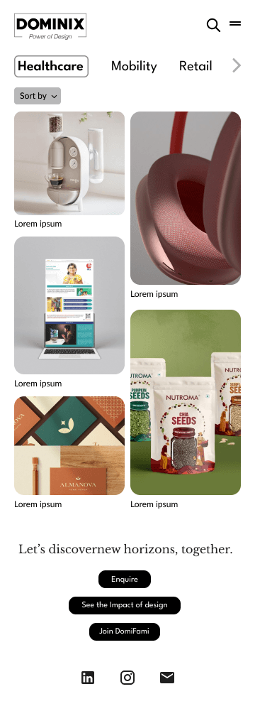
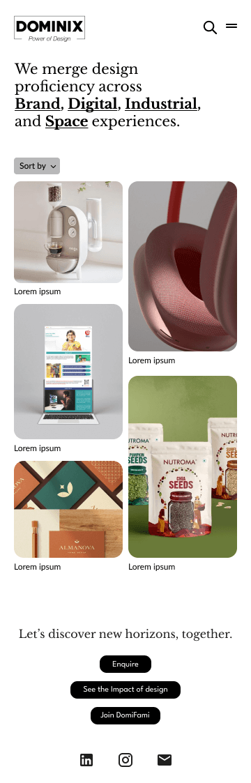
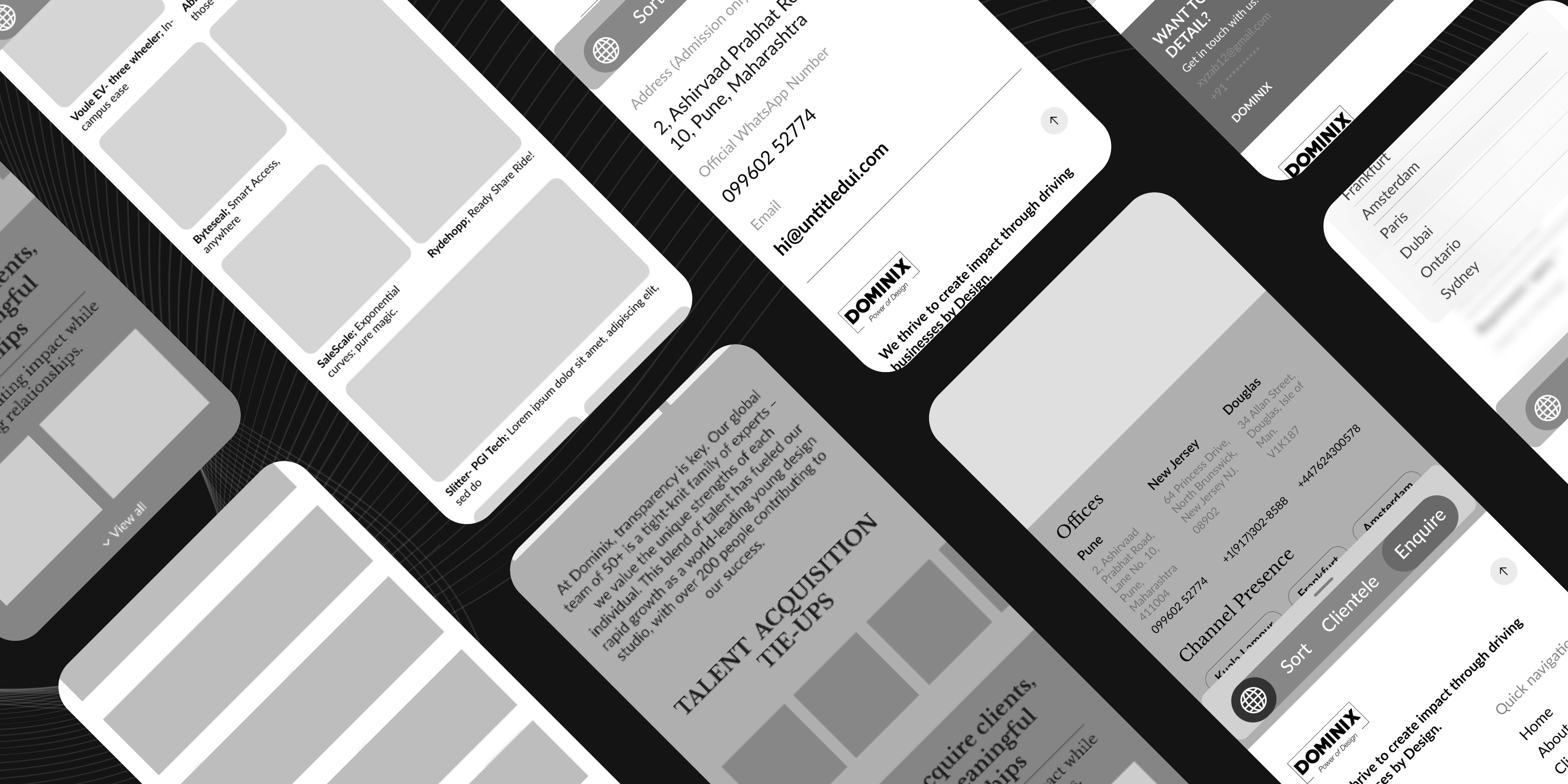
B. Mobile Version
Responsive design ensuring smooth navigation on smaller screens.
Sticky navigation for easy access to key sections.
Touch-friendly buttons and interactive elements for better usability.
View Prototype
Key Takeaways
Understanding user needs and preferences was crucial in shaping an intuitive and engaging website experience.
Designing for both laptop and mobile versions highlighted the need for adaptable layouts and optimized content.
Using bold typography, high-quality images, and a structured layout helped in better content readability and navigation.
Usability testing and feedback-driven improvements refined the interface and ensured a better user journey.